User Interface - Navigation and Layout Part 2
Part 12 of building a Rails 7 application

I am a web developer who has been in the industry since 1995. My current tech stack preference is Ruby on Rails with JavaScript. Originally from Australia but now living in Scotland.
Following on from the previous blog I now have a helper for displaying icons in the application. The next helper that would make life easier is one for adding a link to the side navigation. I'll call it the NavigationHelper:
module NavigationHelper
  def render_sidenav_item(label:, icon:, link:, active: false)
    link_to(link, { class: sidenav_item_class(active: active) }) do
      icon(name: icon, colour: :gray, active: active) << label
    end
  end

  private

  def sidenav_item_class(active:)
    [
      (active ? active_sidenav_item_class : inactive_sidenav_item_class).to_s,
      'group flex items-center px-2 py-2 text-sm font-medium rounded-md'
    ].join(' ')
  end

  def active_sidenav_item_class
    'bg-gray-900 text-white'
  end

  def inactive_sidenav_item_class
    'text-gray-300 hover:bg-gray-700 hover:text-white'
  end
end
It has has one method render_sidenav_item which takes a number of arguments:
- label: - What the item label is
- icon: - Which icon name to display
- link: - Where to go if the item is clicked
- active: false - Are we currently on the page for this navigation link? Defaults to false
Now I'll add one to see how this works:
app/views/application/_sidebar.html.erb
...
      <nav class="mt-5 flex-1 px-2 space-y-1">
        <%= render_sidenav_item(label: 'Products', icon: :library, link: products_path, active: current_page?(controller: :products)) %>
      </nav>
...
My navigation item will be called "Products", the icon will be the library icon, the link uses the Rails helper for the products_path which is the index page and finally I can pass in whether the page I'm currently on matches our link. This will style the navigation item it differently depending on whether this is true or false.
This results in the following:
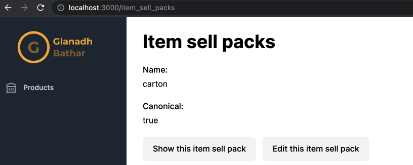
The "Products" link is gray because I'm on the "Item Sell Packs" page (and therefore controller), indicating that this link is not the active page. Now if I follow the navigation link instead I see the following:
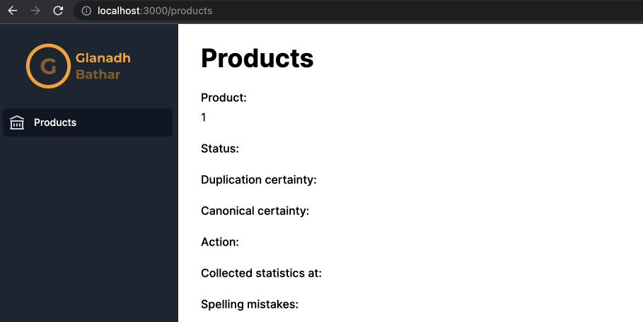
My "Products" link is now white to indicate that is where we are in the application.
I'll add a test for the helper to make sure it is producing the correct HTML for each situation:
require 'test_helper'

# rubocop:disable Layout/TrailingWhitespace
class NavigationHelperTest < ActionView::TestCase
  include IconsHelper

  test 'active navigation link' do
    html = <<~HTML.squish
      <a class="bg-gray-900 text-white group flex items-center px-2 py-2 text-sm font-medium rounded-md"
      href="/products"><svg class="text-gray-300 mr-3 flex-shrink-0 h-6 w-6" xmlns="http://www.w3.org/2000/svg" fill="none"
      viewBox="0 0 24 24" stroke="currentColor" aria-hidden="true"><path stroke-linecap="round" stroke-linejoin="round"
      stroke-width="2" d="M8 14v3m4-3v3m4-3v3M3 21h18M3 10h18M3 7l9-4 9 4M4 10h16v11H4V10z"></path></svg>Products</a>
    HTML

    assert_dom_equal(html, render_sidenav_item(label: 'Products', icon: :library, link: products_path, active: true))
  end

  test 'inactive navigation link' do
    html = <<~HTML.squish
      <a class="text-gray-300 hover:bg-gray-700 hover:text-white group flex items-center px-2 py-2 text-sm font-medium rounded-md"
      href="/products"><svg class="text-gray-400 group-hover:text-gray-300 mr-3 flex-shrink-0 h-6 w-6"
      xmlns="http://www.w3.org/2000/svg" fill="none" viewBox="0 0 24 24" stroke="currentColor" aria-hidden="true"><path
      stroke-linecap="round" stroke-linejoin="round" stroke-width="2"
      d="M8 14v3m4-3v3m4-3v3M3 21h18M3 10h18M3 7l9-4 9 4M4 10h16v11H4V10z"></path></svg>Products</a>
    HTML

    assert_dom_equal(html, render_sidenav_item(label: 'Products', icon: :library, link: products_path, active: false))
  end
end
# rubocop:enable Layout/TrailingWhitespace
The next challenge is I'd like to have a collapsible navigation item that contains sub items underneath it. This can be achieved with a small amount of JavaScript and the Stimulus library.
First I'll just add the HTML for this to the partial holding the navigation. I've placed it just below the render_sidenav_item call that I just added.
      <nav class="mt-5 flex-1 px-2 space-y-1">
        <%= render_sidenav_item(label: 'Products', icon: :library, link: products_path, active: current_page?(controller: :products)) %>

        <div class="space-y-1" data-controller="navigation" data-navigation-current-path-value="<%= request.original_url %>">
          <!-- Current: "bg-gray-100 text-gray-900", Default: "bg-white text-gray-600 hover:bg-gray-50 hover:text-gray-900" -->
          <button type="button" class="text-gray-300 hover:bg-gray-700 hover:text-white group w-full flex items-center pl-2 pr-1 py-2 text-left text-sm font-medium rounded-md focus:outline-none focus:ring-2 focus:ring-indigo-500" aria-controls="sub-menu-1" aria-expanded="false" data-action="click->navigation#toggle">
            <%= icon(name: :cog, colour: :gray) %>
            <span class="flex-1"> Item Setup </span>
            <!-- Expanded: "text-gray-400 rotate-90", Collapsed: "text-gray-300" -->
            <svg  data-navigation-target="expander" class="text-gray-300 ml-3 flex-shrink-0 h-5 w-5 transform group-hover:text-gray-400 transition-colors ease-in-out duration-150" viewBox="0 0 20 20" aria-hidden="true">
              <path d="M6 6L14 10L6 14V6Z" fill="currentColor" />
            </svg>
          </button>
          <!-- Expandable link section, show/hide based on state. -->
          <div class="space-y-1" id="item-setup-sub-navigation">
            <a id="item-measures-navigation" href="<%= item_measures_path %>" data-navigation-target="element" class="hidden group w-full flex items-center pl-11 pr-2 py-2 text-sm font-medium rounded-md text-gray-300 hover:bg-gray-700 hover:text-white"> Item Measures </a>

            <a id="item-packs-navigation" href="<%= item_packs_path %>" data-navigation-target="element" class="hidden group w-full flex items-center pl-11 pr-2 py-2 text-sm font-medium rounded-md text-gray-300 hover:bg-gray-700 hover:text-white"> Item Packs </a>

            <a id="item-sell-packs-navigation" href="<%= item_sell_packs_path %>" data-navigation-target="element" class="hidden group w-full flex items-center pl-11 pr-2 py-2 text-sm font-medium rounded-md text-gray-300 hover:bg-gray-700 hover:text-white"> Item Sell Packs </a>

            <a id="brands-navigation" href="<%= brands_path %>" data-navigation-target="element" class="hidden group w-full flex items-center pl-11 pr-2 py-2 text-sm font-medium rounded-md text-gray-300 hover:bg-gray-700 hover:text-white"> Brands </a>
          </div>
        </div>
      </nav>
There is a top level button labeled "Item Setup" and four sub items with their appropriate paths and labels added.
Note also some code has been added to make this interactive via Stimulus. The first is a controller called navigation has been set on the surrounding div:
<div class="space-y-1" data-controller="navigation">
The second is an action has been added to the button:
<button type="button" ... data-action="click->navigation#toggle">
This action can be read as when a user clicks (click event) call the navigation controller method called toggle.
What does this controller look like then?
import { Controller } from "@hotwired/stimulus"

export default class extends Controller {
  static targets = ["element", "expander"];
  static values = {
    currentPath: String
  }

  elementTargetConnected(target) {
    // If the path for the target is the same as the current then expand the menu and mark it as active
    if (this.currentPathValue === target.href) {
      this.toggleExpander();
      this.toggleElementVisibility();
      this.setActive(target);
    }
  }

  toggle(event) {
    event.preventDefault();
    this.toggleExpander();
    this.toggleElementVisibility();
  }

  toggleExpander() {
    // Rotate the triangle icon representing whether the menu is open or not
    if (this.expanderTarget.classList.contains("text-gray-300")) {
      this.expanderTarget.classList.remove("text-gray-300");
      this.expanderTarget.classList.add("text-gray-400", "rotate-90");
    } else {
      this.expanderTarget.classList.remove("text-gray-400", "rotate-90");
      this.expanderTarget.classList.add("text-gray-300");
    }
  }

  toggleElementVisibility() {
    // Show or hide the elements underneath the expander
    this.elementTargets.forEach((element) => {
      if (element.classList.contains("hidden")) {
        element.classList.remove("hidden");
        element.classList.add("block");
      } else {
        element.classList.add("hidden");
        element.classList.remove("block");
      }
    });
  }

  setActive(target) {
    target.classList.remove("text-gray-300", "hover:bg-gray-700", "hover:text-white")
    target.classList.add("bg-gray-900", "text-white")
  }
}
The toggle method is what my button will call. It manipulates the classes on the elements to display the sub menu correctly based on its current state.
The elementTargetConnected method is what allows a the sub menu to open and highlight the currently selected navigation item based on the user's current browser page. Setting the currentPathValue is done by specifying this attribute on the div holding the sub menu: data-navigation-current-path-value="<%= request.original_url %>"
Note that this will only currently support having a single expandable menu item. If more are needed then this will need to be refactored.
Here is how this all works in practice:
Finally there needs to be some system testing on this navigation to ensure it works correctly. I've added a set of tests to a NavigationTest:
require 'application_system_test_case'

class NavigationTest < ApplicationSystemTestCase
  test 'expanding and closing the Item Setup menu' do
    visit products_url
    assert_no_selector(:css, '#item-setup-sub-navigation a')

    # Open the menu
    within('#side-navigation') do
      click_on 'Item Setup'
    end
    assert_selector(:css, '#item-setup-sub-navigation a')

    # Close the menu
    within('#side-navigation') do
      click_on 'Item Setup'
    end
    assert_no_selector(:css, '#item-setup-sub-navigation a')
  end

  test 'marking sub menu as active' do
    visit item_sell_packs_url
    assert_selector(:css, '#item-measures-navigation.text-gray-300')
    assert_selector(:css, '#item-sell-packs-navigation.bg-gray-900.text-white')
    assert_selector(:css, '#item-packs-navigation.text-gray-300')
    assert_selector(:css, '#brands-navigation.text-gray-300')
  end

  test 'following the Products navigation item' do
    visit brands_url
    within('#side-navigation') do
      click_on 'Products'
    end
    assert_current_path('/products')
  end

  ...
end
Useful links
https://stimulus.hotwired.dev/reference/controllers
https://www.rubydoc.info/github/jnicklas/capybara/Capybara/Minitest/Assertions
https://github.com/teamcapybara/capybara#the-dsl


