User Interface - Navigation and Layout Part 1
Part 11 of building a Rails 7 application

I am a web developer who has been in the industry since 1995. My current tech stack preference is Ruby on Rails with JavaScript. Originally from Australia but now living in Scotland.
So I am at the point now where quite a bit of the back end infrastructure is set up for my application. I can now turn my attention to some of the user experience.
In the past I have used a few different options for generating the user interface. The most basic being of course plain HTML. Then HTML with an embedded JavaScript framework to build interactive components such as editable grids and dialogs. I have also used ReactJS and a GraphQL API to create a Single Page Application (SPA).
For this project I want to experiment with Hotwire, which transmits "HTML over the wire" as opposed to JSON for a ReactJS application for instance. It has two major components; Turbo for streaming HTML fragments, and Stimulus which is JavaScript for adding "interactivity" to the application.
I'll also be using TailwindCSS for the styling of the application, and in particular the components provided by TailwindUI. This CSS framework has become very popular recently and is one of the supported CSS options out of the box in a new Rails 7 application.
Back in Part 2 of this series is where I specified that I wanted to use Tailwind:
% rails new catalogue_cleanser --css tailwind --database=postgresql
At this stage I will only focus on the desktop application, a later blog will address how to make a nicer mobile experience.
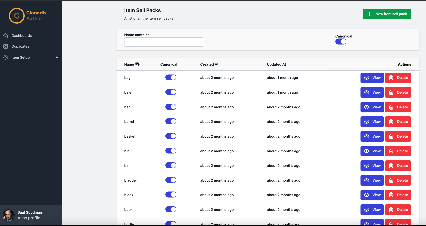
This is the look I'm going for at least initially:
At the moment my application.html.erb looks like this:
<!DOCTYPE html>
<html>
  <head>
    <title>CatalogueCleanser</title>
    <meta name="viewport" content="width=device-width,initial-scale=1">
    <%= csrf_meta_tags %>
    <%= csp_meta_tag %>
    <%= stylesheet_link_tag "tailwind", "inter-font", "data-turbo-track": "reload" %>

    <%= stylesheet_link_tag "application", "data-turbo-track": "reload" %>
    <%= javascript_importmap_tags %>
  </head>

  <body>
    <main class="container mx-auto mt-28 px-5 flex">
      <%= yield %>
    </main>
  </body>
</html>
The first thing I want to do is break this into smaller partials to make it easier to understand. In a future blog I'll be looking at using ViewComponent to further encapsulate the components as code.
There is an obvious "head" partial here so I'll extract that:
app\views\application\_head.html.erb
<head>
  <title>CatalogueCleanser</title>
  <meta name="viewport" content="width=device-width,initial-scale=1">
  <%= csrf_meta_tags %>
  <%= csp_meta_tag %>
  <%= stylesheet_link_tag "tailwind", "inter-font", "data-turbo-track": "reload" %>

  <%= stylesheet_link_tag "application", "data-turbo-track": "reload" %>
  <%= javascript_importmap_tags %>
</head>
And now the application.html.erb looks like this:
<!DOCTYPE html>
<html>
  <%= render "application/head" %>
  <body>
    <main class="container mx-auto mt-28 px-5 flex">
      <%= yield %>
    </main>
  </body>
</html>
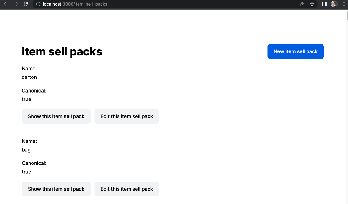
Checking that we haven't broken anything, this is what the "ItemSellPack" index page looks like:
I'll now extract the main content of the page into its own partial:
app/views/application/_main.html.erb
<main class="flex-1">
  <div class="py-6">
    <div class="max-w-7xl mx-auto px-4 sm:px-6 md:px-8">
      <%= yield %>
    </div>
  </div>
</main>
Which makes the the application.html.erb look like this:
<!DOCTYPE html>
<html>
  <%= render "application/head" %>
  <body>
    <%= render "application/main" %>>
  </body>
</html>
TailwindUI provides a nice side navigation component so I'll drop that in next as its own partial. I won't include the source for that as it is too large. But the application.html.erb now looks like this:
<!DOCTYPE html>
<html>
  <%= render "application/head" %>
  <body>
    <%= render "application/sidebar" %>
    <div class="md:pl-64 flex flex-col flex-1">
      <div class="sticky top-0 z-10 md:hidden pl-1 pt-1 sm:pl-3 sm:pt-3 bg-gray-100">
        <button type="button" class="-ml-0.5 -mt-0.5 h-12 w-12 inline-flex items-center justify-center rounded-md text-gray-500 hover:text-gray-900 focus:outline-none focus:ring-2 focus:ring-inset focus:ring-indigo-500">
          <span class="sr-only">Open sidebar</span>
          <!-- Heroicon name: outline/menu -->
          <svg class="h-6 w-6" xmlns="http://www.w3.org/2000/svg" fill="none" viewBox="0 0 24 24" stroke="currentColor" aria-hidden="true">
            <path stroke-linecap="round" stroke-linejoin="round" stroke-width="2" d="M4 6h16M4 12h16M4 18h16"/>
          </svg>
        </button>
      </div>
      <%= render "application/main" %>
    </div>
  </body>
</html>
and my page looks like this:
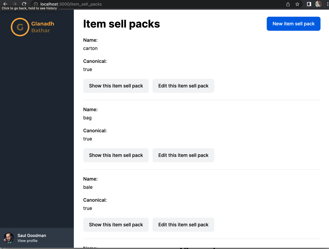
I added my own logo and took a bit of creative licence with the user profile (thanks Better Call Saul!). If you're wondering what "Glanadh Bathar" means it is Scots Gaelic for "Catalogue Cleanser" (roughly).
The next step is to add some navigation links. But before I get to that I'll need a way to handle displaying icons in the application. They'll be used in the navigation and in other user interface elements. TailwindCSS uses heroicons, a set of icons the makers of TailwindCSS produced so I will do likewise.
To make it easier to insert an icon anywhere I'll create an IconsHelper:
module IconsHelper
  def icon(name:, colour:, active: false, style: :outline, size: 6)
    content_tag(:svg, {
      class: icon_class(active: active, colour: colour, size: size),
      xmlns: 'http://www.w3.org/2000/svg',
      fill: 'none',
      viewBox: '0 0 24 24',
      stroke: 'currentColor',
      "aria-hidden": 'true'
    }
    ) { safe_join(heroicons[style][name].map { |d| concat(svg_path_content(draw: d)) }) }
  end

  private

  def svg_path_content(draw:)
    content_tag(:path, nil, {
                  "stroke-linecap": 'round',
                  "stroke-linejoin": 'round',
                  "stroke-width": '2',
                  "d": draw
                })
  end

  def icon_class(active:, colour:, size:)
    [
      (active ? icon_colour_classes[:active][colour] : icon_colour_classes[:inactive][colour]),
      "mr-3 flex-shrink-0 h-#{size} w-#{size}"
    ].join(' ')
  end

  def heroicons
    # https://heroicons.com/
    {
      outline: {
        clipboard_list: ['M9 5H7a2 2 0 00-2 2v12a2 2 0 002 2h10a2 2 0 002-2V7a2 2 0 00-2-2h-2M9 5a2 2 0 002 2h2a2 2 0 002-2M9 5a2 2 0 012-2h2a2 2 0 012 2m-3 7h3m-3 4h3m-6-4h.01M9 16h.01'],
        collection: ['M19 11H5m14 0a2 2 0 012 2v6a2 2 0 01-2 2H5a2 2 0 01-2-2v-6a2 2 0 012-2m14 0V9a2 2 0 00-2-2M5 11V9a2 2 0 012-2m0 0V5a2 2 0 012-2h6a2 2 0 012 2v2M7 7h10'],
        eye: [
          'M15 12a3 3 0 11-6 0 3 3 0 016 0z',
          'M2.458 12C3.732 7.943 7.523 5 12 5c4.478 0 8.268 2.943 9.542 7-1.274 4.057-5.064 7-9.542 7-4.477 0-8.268-2.943-9.542-7z'
        ],
        folder: ['M3 7v10a2 2 0 002 2h14a2 2 0 002-2V9a2 2 0 00-2-2h-6l-2-2H5a2 2 0 00-2 2z'],
        folder_open: ['M5 19a2 2 0 01-2-2V7a2 2 0 012-2h4l2 2h4a2 2 0 012 2v1M5 19h14a2 2 0 002-2v-5a2 2 0 00-2-2H9a2 2 0 00-2 2v5a2 2 0 01-2 2z'],
        home: ['M3 12l2-2m0 0l7-7 7 7M5 10v10a1 1 0 001 1h3m10-11l2 2m-2-2v10a1 1 0 01-1 1h-3m-6 0a1 1 0 001-1v-4a1 1 0 011-1h2a1 1 0 011 1v4a1 1 0 001 1m-6 0h6'],
        library: ['M8 14v3m4-3v3m4-3v3M3 21h18M3 10h18M3 7l9-4 9 4M4 10h16v11H4V10z'],
        pencil: ['M15.232 5.232l3.536 3.536m-2.036-5.036a2.5 2.5 0 113.536 3.536L6.5 21.036H3v-3.572L16.732 3.732z'],
        sort_ascending: ['M3 4h13M3 8h9m-9 4h6m4 0l4-4m0 0l4 4m-4-4v12'],
        sort_descending: ['M3 4h13M3 8h9m-9 4h9m5-4v12m0 0l-4-4m4 4l4-4'],
      }
    }
  end

  def icon_colour_classes
    # Tailwind UI
    {
      active: {
        white: 'text-white',
        gray: 'text-gray-300',
        red: 'text-red-300',
        orange: 'text-orange-300',
        yellow: 'text-yellow-300',
        green: 'text-green-300',
        blue: 'text-blue-300',
        indigo: 'text-indigo-300'
      },
      inactive: {
        white: 'text-white group-hover:text-white',
        gray: 'text-gray-400 group-hover:text-gray-300',
        red: 'text-red-400 group-hover:text-red-300',
        orange: 'text-orange-400 group-hover:text-orange-300',
        yellow: 'text-yellow-400 group-hover:text-yellow-300',
        green: 'text-green-400 group-hover:text-green-300',
        blue: 'text-blue-400 group-hover:text-blue-300',
        indigo: 'text-indigo-400 group-hover:text-indigo-300'
      }
    }
  end
end
It has one method icon which takes a number of arguments:
- name: - The icon to use, matches up with what heroicons calls them
- colour: - What colour the icon should be
- active: false - Whether the icon is currently in an "active" state, defaulting to false
- style: :outline - Heroicons provides an "outline" or "solid" version of their icons, defaulting to outline
- size: 6 - What size to make the icon, defaulting to 6
I should also test that I am getting the correct HTML when calling this helper so I'll add a series of tests for it:
require 'test_helper'

# rubocop:disable Layout/TrailingWhitespace
class IconsHelperTest < ActionView::TestCase
  test 'icon with default settings' do
    svg_html = <<~HTML.squish
      <svg class="text-gray-400 group-hover:text-gray-300 mr-3 flex-shrink-0 h-6 w-6"
      xmlns="http://www.w3.org/2000/svg" fill="none" viewBox="0 0 24 24" stroke="currentColor" aria-hidden="true"><path
      stroke-linecap="round" stroke-linejoin="round" stroke-width="2"
      d="M8 14v3m4-3v3m4-3v3M3 21h18M3 10h18M3 7l9-4 9 4M4 10h16v11H4V10z"></path></svg>
    HTML

    assert_dom_equal(svg_html, icon(name: :library, colour: :gray))
  end

  test 'icon that is active' do
    svg_html = <<~HTML.squish
      <svg class="text-yellow-300 mr-3 flex-shrink-0 h-6 w-6" xmlns="http://www.w3.org/2000/svg" fill="none"
      viewBox="0 0 24 24" stroke="currentColor" aria-hidden="true"><path stroke-linecap="round" stroke-linejoin="round"
      stroke-width="2" d="M3 7v10a2 2 0 002 2h14a2 2 0 002-2V9a2 2 0 00-2-2h-6l-2-2H5a2 2 0 00-2 2z"></path></svg>
    HTML

    assert_dom_equal(svg_html, icon(name: :folder, colour: :yellow, active: true))
  end

  test 'icon with a different size' do
    svg_html = <<~HTML.squish
      <svg class="text-red-400 group-hover:text-red-300 mr-3 flex-shrink-0 h-9 w-9" xmlns="http://www.w3.org/2000/svg"
      fill="none" viewBox="0 0 24 24" stroke="currentColor" aria-hidden="true"><path stroke-linecap="round"
      stroke-linejoin="round" stroke-width="2"
      d="M19 7l-.867 12.142A2 2 0 0116.138 21H7.862a2 2 0 01-1.995-1.858L5 7m5 4v6m4-6v6m1-10V4a1 1 0 00-1-1h-4a1 1 0 00-1 1v3M4 7h16"></path></svg>
    HTML

    assert_dom_equal(svg_html, icon(name: :trash, colour: :red, size: 9))
  end
end
# rubocop:enable Layout/TrailingWhitespace
As this blog is starting to get quite long I'll end this one here and in the next one I'll tackle adding some links to the navigation.
Useful links:
https://hotwired.dev/
https://tailwindcss.com/
https://tailwindui.com/
https://heroicons.com/


