Inline Editing and Deleting with Hotwire - Part 1
Part 16 of building a Rails 7 application

I am a web developer who has been in the industry since 1995. My current tech stack preference is Ruby on Rails with JavaScript. Originally from Australia but now living in Scotland.
The majority of editing in the application I am thinking will be a single field at a time, preferably without needing to open a new page to do so. The best way to achieve that will be to allow inline editing of my collection rows. I can also give buttons that will let a user delete a record. If they do wish to view more information about a record give them a way to get to the "show" page.
I also want changes that one user makes on the screen be reflected on anyone else's screen who is looking at the same record. This can be achieved by using more Hotwire magic.
Since this is going to be quite a few changes this blog will be broken into two parts. This first part will deal with styling the "show" and "edit" pages, then adding functional "View" and "Delete" buttons to the index page. The second part will be the inline editing.
Here is what will be working by the end of this blog (spoiler alert!):
The first steps will be to apply some nice TailwindUI components to the existing views making good use of ViewComponent as well. The work done here will be getting re-used in part 2 for the inline editing on the collection grid.
Again, here is the component break down I am envisaging for the screen when viewing or editing a specific resource:
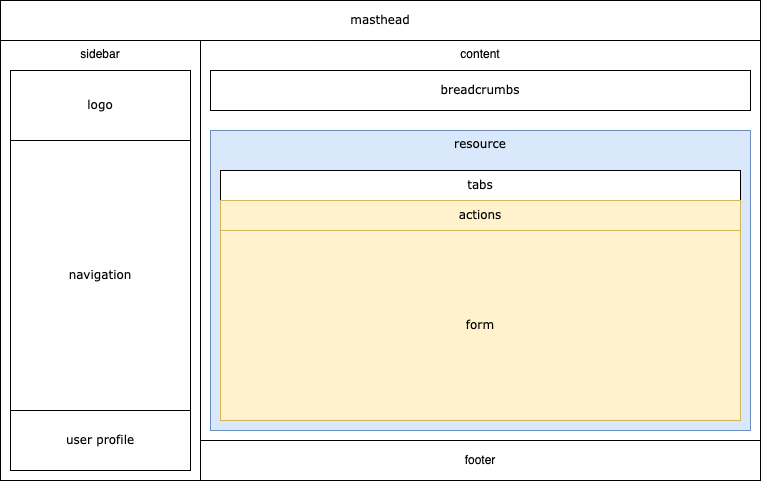
The blue and yellow components are what I'll tackle for now.
"Actions" are what the user can do while on the screen. They could be deleting, navigating somewhere else, printing and so on. Effectively it is a row of buttons, so the first component I will need is one for buttons:
app/components/button/component.rb
module Button
  class Component < ViewComponent::Base
    include IconsHelper

    attr_reader :id, :label, :options

    def initialize(id:, label:, options:)
      super
      @id = id
      @label = label
      @options = options
    end
  end
end
app/components/button/component.html.erb
<button
  id="<%= id %>"
  type="button"
  title="<%= options[:title] %>"
  class="<%= options[:colour_classes] %> inline-flex items-center px-3 py-2 border border-transparent shadow-sm text-sm leading-4 font-medium rounded-full focus:outline-none focus:ring-2 focus:ring-offset-2"
  data-action="<%= options.dig(:data, :action) %>"
  <% options.fetch(:data, {}).fetch(:params, []).each do |param| %>
  data-<%= param[:name] %>-param="<%= param[:value] %>"
  <% end %>
>
  <% if options[:icon].present? %>
    <%= icon(**options[:icon]) %>
  <% end %>
  <%= label %>
</button>
A Button::Component can take an id, a label to display and then a nebulous options hash, containing such things as icon options, the colour classes to apply and any data attributes. As we've seen before the "data" attributes are how Stimulus code can be configured. More on this later.
Now that there is a neat way to make buttons I can make the Actions component. I'll be using a TailwindUI "divider" for this purpose.
app/components/resource_actions/component.rb
module ResourceActions
  class Component < ViewComponent::Base
    renders_many :buttons, Button::Component
  end
end
app/components/resource_actions/component.html.erb
<div class="sticky top-0">
<div class="absolute inset-0 flex items-center" aria-hidden="true">
<div class="w-full border-t border-gray-300"></div>
</div>
<div class="relative flex items-center justify-end space-x-1" data-controller="resource">
<span class="pr-3 text-lg font-medium text-gray-900"> </span>
<% buttons.each do |button| %>
<%= button %>
<% end %>
</div>
</div>
There is nothing complicated about this component, it will simply display any Button components passed to it. There are two Tailwind classes (sticky top-0) I have added which makes this action bar stick to the top of the screen as the user scrolls down. I believe that will make the user experience better as those buttons will always be available. Using this component I can add some Storybook stories to see what this will look like:
test/components/stories/resource_actions/component_stories.rb
module ResourceActions
  class ComponentStories < ApplicationStories
    story :show do
      button(
        id: 'resource_back',
        label: 'Back',
        options: {
          title: 'http::/example.com/collection',
          icon: { name: :arrow_left, colour: :white },
          colour_classes: 'text-white bg-indigo-600 hover:bg-indigo-700 focus:ring-indigo-200'
        }
      )
      button(
        id: 'resource_edit',
        label: 'Edit',
        options: {
          title: 'Edit',
          icon: { name: :pencil, colour: :white },
          colour_classes: 'text-white bg-amber-600 hover:bg-amber-700 focus:ring-amber-200'
        }
      )
    end

    story :edit do
      button(
        id: 'resource_back',
        label: 'Back',
        options: {
          title: 'http::/example.com/collection',
          icon: { name: :arrow_left, colour: :white },
          colour_classes: 'text-white bg-indigo-600 hover:bg-indigo-700 focus:ring-indigo-200'
        }
      )
      button(
        id: 'resource_update',
        label: 'Update',
        options: {
          icon: { name: :save, colour: :white },
          colour_classes: 'text-white bg-emerald-600 hover:bg-emerald-700 focus:ring-emerald-200'
        }
      )
      button(
        id: 'resource_delete',
        label: 'Delete',
        options: {
          icon: { name: :trash, colour: :white },
          colour_classes: 'text-white bg-red-500 hover:bg-red-600 focus:ring-red-200'
        }
      )
    end
  end
end
There are two stories so far, one for the action component when looking at the "View" screen, and another for the "Edit" screen. Here is what Storybook shows me:
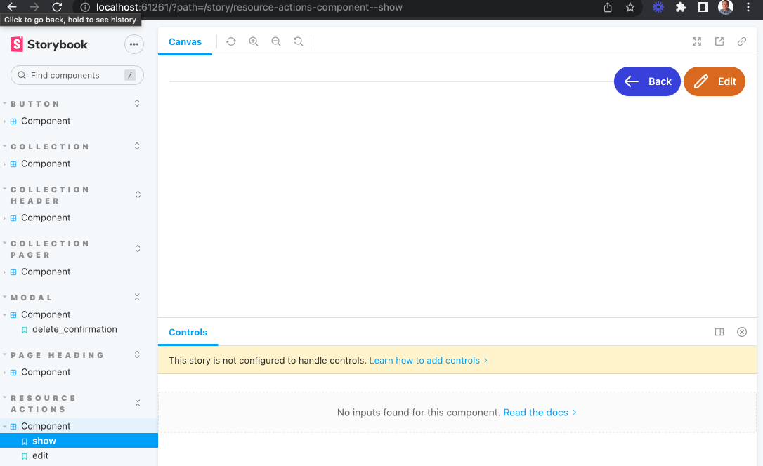
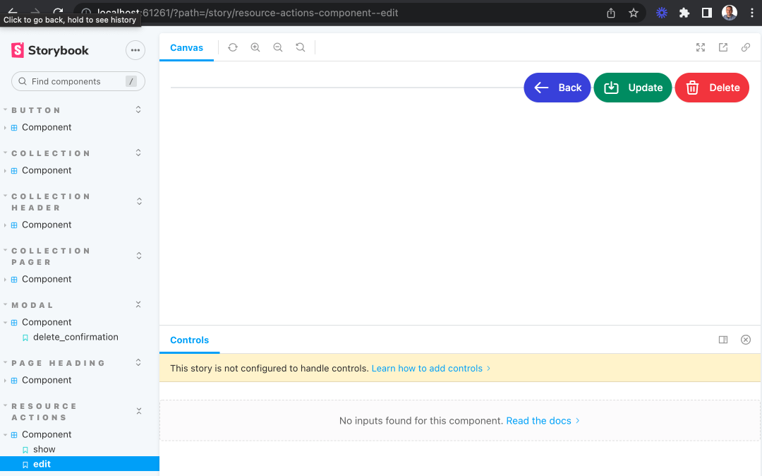
Looking good so far. They don't do anything yet and aren't being displayed by a page but I'll address that later. The next thing is make the "Form" component that will sit under the "Actions" component.
app/components/resource_form/component.rb
module ResourceForm
  class Component < ViewComponent::Base
    include IconsHelper

    renders_many :fields, ResourceForm::FieldComponent

    attr_reader :title, :description, :resource

    def initialize(title:, description:, resource:)
      super
      @title = title
      @description = description
      @resource = resource
    end

    def form_id
      dom_id(resource, :form)
    end
  end
end
app/components/resource_form/component.html.erb
<div class="mt-4 shadow sm:rounded-md sm:overflow-hidden">
  <div class="px-4 py-5 bg-white space-y-6 sm:p-6" data-controller="resource-form--component resource">
    <form
      id="<%= form_id %>"
      action="<%= polymorphic_path(resource) %>"
      method="post"
      accept-charset="UTF-8"
      class="space-y-8 divide-y divide-gray-200"
    >
      <% if resource.errors.any? %>
        <div id="error_explanation" class="bg-red-50 text-red-500 px-3 py-2 font-medium rounded-lg mt-3">
          <h2><%= pluralize(resource.errors.count, "error") %> prohibited this from being saved:</h2>

          <ul>
            <% resource.errors.each do |error| %>
              <li><%= error.full_message %></li>
            <% end %>
          </ul>
        </div>
      <% end %>
      <div class="space-y-8 divide-y divide-gray-200 sm:space-y-5">
        <div>
          <div>
            <h3 class="text-lg leading-6 font-medium text-gray-900"><%= title %></h3>
            <p class="mt-1 max-w-2xl text-sm text-gray-500"><%= description %></p>
          </div>
          <div class="pt-8 space-y-6 sm:pt-10 sm:space-y-5">
            <div class="space-y-6 sm:space-y-5">
              <% fields.each do |field| %>
                <%= field %>
              <% end %>
            </div>
          </div>
        </div>
      </div>
      <div>
        <input type="hidden" name="_method" value="patch" autocomplete="off"/>
        <%= hidden_field_tag :authenticity_token, form_authenticity_token %>
      </div>
    </form>
  </div>
</div>
So this is a little more complicated. The component is building an HTML form containing a title and description section and then iterating over a set of fields of type ResourceForm::FieldComponent. There is also some hidden fields at the bottom, the first telling Rails that this form will be using a HTTP patch method when its responds to this for submission request. The second is the authenticity_token used to prevent Cross-Site Request Forgery (CSRF) attacks.
Note also that I'm not using any of the built in Rails helpers for the construction of forms. This choice makes it easier to isolate the components as they do not need any instances of any sort of form helper to be passed around. There is a project under way to provide a way to use a FormBuilder to use ViewComponent elements here. This may be worth investigating again at a later date.
Fields can be of many different types on a form, such as text, toggle switches, date pickers and so on. To accommodate this I can use a feature of ViewComponent called polymorphic slots. The component looks like this:
app/components/resource_form/field_component.rb
module ResourceForm
  class FieldComponent < ViewComponent::Base
    include ViewComponent::PolymorphicSlots
    include IconsHelper

    renders_one :attribute, types: {
      text: ResourceForm::TextComponent,
      toggle: ResourceForm::ToggleComponent,
      timestamp: ResourceForm::TimestampComponent
    }
  end
end
In here I have declared three different types of attributes, when rendering one I can specify which type I want and the FieldComponent will then render the matching component. Here is a TextComponent for example:
app/components/resource_form/text_component.rb
module ResourceForm
  class TextComponent < BaseComponent
  end
end
app/components/resource_form/text_component.html.erb
<div class="sm:grid sm:grid-cols-3 sm:gap-4 sm:items-start sm:border-t sm:border-gray-200 sm:pt-5">
  <div>
    <label for="<%= field_id %>" class="block text-sm font-medium text-gray-700 sm:mt-px sm:pt-"><%= label %></label>
    <% if help.present? %>
      <div class="mt-2 text-sm text-gray-300 inline-flex items-center">
        <%= icon(name: :question_mark_circle, colour: :blue, options: { size: 5 }) %><%= help %>
      </div>
    <% end %>
  </div>
  <div class="mt-1 sm:mt-0 sm:col-span-2">
    <% if readonly %>
      <p class="mt-2 text-sm text-gray-500"><%= resource.public_send(attribute) %></p>
    <% else %>
    <div class="max-w-lg flex rounded-md shadow-sm">
      <input
        class="flex-1 block w-full focus:ring-indigo-500 focus:border-indigo-500 min-w-0 rounded-none rounded-r-md sm:text-sm border-gray-300"
        autofocus="autofocus"
        type="text"
        value="<%= resource.public_send(attribute) %>"
        name="<%= field_name %>"
        id="<%= field_id %>"
      >
    </div>
    <% end %>
  </div>
</div>
I can also add Storybook stories for these individual field components to see what they will look like. It is also an opportunity to test out Storybook "controls":
test/components/stories/resource_form/text_component_stories.rb
module ResourceForm
  class TextComponentStories < ApplicationStories
    story :basic do
      constructor(
        attribute: text('name'),
        label: text('Name'),
        resource: klazz(ItemSellPack, name: text('carton'), canonical: true),
        readonly: boolean(false)
      )
    end
  end
end
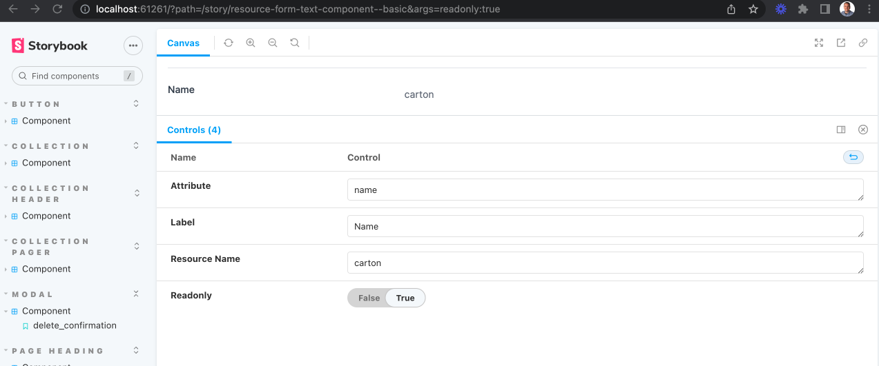
The neat thing with controls is I can experiment with what the component looks like in certain scenarios, such as being in a read only mode for example:
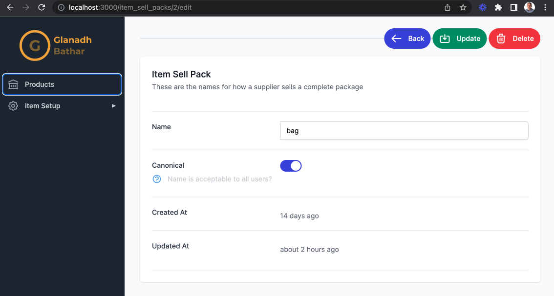
Combining all of these components together lets me do something like this:
<%= render ResourceForm::Component.new(
    title: 'Item Sell Pack',
    description: 'These are the names for how a supplier sells a complete package',
    resource: @resource) do |component| %>
  <% component.with_field do |c| %>
    <% c.with_attribute_text(attribute: :name, label: 'Name', resource: @resource, readonly: readonly) %>
  <% end %>
  <% component.with_field do |c| %>
    <% c.with_attribute_toggle(
           attribute: :canonical,
           label: 'Canonical',
           resource: @resource,
           readonly: readonly,
           help: 'Name is acceptable to all users?'
       ) %>
  <% end %>
  <% component.with_field do |c| %>
    <% c.with_attribute_timestamp(attribute: :created_at, label: 'Created At', resource: @resource) %>
  <% end %>
  <% component.with_field do |c| %>
    <% c.with_attribute_timestamp(attribute: :updated_at, label: 'Updated At', resource: @resource) %>
  <% end %>
<% end %>
And this is reusable on both the "Show" and "Edit" pages by providing a readonly flag. Here is what the "Edit" page now looks like:
The next stage is to make these buttons, toggles and so on do something. In order to make the toggle function I need to set a hidden field with the actual true/false value. Some Stimulus can achieve that:
app/components/resource_form/component_controller.js
import { Controller } from "@hotwired/stimulus"
import cash from "cash-dom"

export default class extends Controller {
  toggle(event) {
    const toggle = cash(`#${event.params.toggleId}`)
    const button = toggle.parent('button')
    const input = cash(`#${event.params.fieldId}`)
    const toggled = input.val() === 'true'

    input.val(!toggled)
    toggle.toggleClass('translate-x-0 translate-x-5')
    button.toggleClass('bg-gray-200 bg-indigo-600')
  }
}
Here is what the HTML for a ToggleComponent looks like:
<div class="sm:grid sm:grid-cols-3 sm:gap-4 sm:items-start sm:border-t sm:border-gray-200 sm:pt-5" data-controller="resource-form--component resource">
  <div>
    <label for="<%= field_id %>" class="block text-sm font-medium text-gray-700 sm:mt-px sm:pt-"><%= label %></label>
    <% if help.present? %>
      <div class="mt-2 text-sm text-gray-300 inline-flex items-center">
        <%= icon(name: :question_mark_circle, colour: :blue, options: { size: 5 }) %><%= help %>
      </div>
    <% end %>
  </div>
  <div class="mt-1 sm:mt-0 sm:col-span-2">
    <input
      type="hidden"
      value="<%= resource.public_send(attribute) %>"
      name="<%= field_name %>"
      id="<%= field_id %>"
    >
    <!-- Enabled: "bg-indigo-600", Not Enabled: "bg-gray-200" -->
    <button
      type="button"
      class="<%= resource.public_send("#{attribute}?") ? 'bg-indigo-600' : 'bg-gray-200' %> relative inline-flex flex-shrink-0 h-6 w-11 border-2 border-transparent rounded-full cursor-pointer transition-colors ease-in-out duration-200 focus:outline-none focus:ring-2 focus:ring-offset-2 focus:ring-indigo-500"
      role="switch"
      aria-checked="false"
      data-action="click->resource-form--component#toggle"
      data-resource-form--component-toggle-id-param="<%= toggle_id %>"
      data-resource-form--component-field-id-param="<%= field_id %>"
    >
      <!-- Enabled: "translate-x-5", Not Enabled: "translate-x-0" -->
      <span
        id="<%= toggle_id %>"
        aria-hidden="true"
        class="<%= resource.public_send("#{attribute}?") ? 'translate-x-5' : 'translate-x-0' %> pointer-events-none inline-block h-5 w-5 rounded-full bg-white shadow transform ring-0 transition ease-in-out duration-200"
      >
      </span>
    </button>
  </div>
</div>
It has a hidden field and a button for the toggle. The controller simply toggles these two elements when the user clicks the button. Now on to the buttons on the Actions component. The way I have approached this is that I expect there will be events on a single resource that will require sending information to and from the server. So I've made a "resource" controller:
app/javascript/controllers/resource_controller.js
import { destroy } from "@rails/request.js";
import { Controller } from "@hotwired/stimulus"
import cash from "cash-dom"

export default class extends Controller {
  navigate(event) {
    window.location = event.params.url
  }

  update(event) {
    const formId = event.params.formId
    const form = cash(`#${formId}`)[0]

    form.requestSubmit()
  }

  confirmDelete(event) {
    const resourceId = event.params.id
    const modalName = event.params.modalName
    const modal = cash(`#${modalName}_modal`)
    const confirmDeleteButton = cash(`#confirm_delete`)

    confirmDeleteButton.data('resource-id-param', resourceId)
    modal.show()
  }

  inlineDelete(event) {
    const resourceId = event.params.id
    const resourceUrl = event.params.url
    const modalName = event.params.modalName
    const modal = cash(`#${modalName}_modal`)

    modal.hide()
    destroy(`${resourceUrl}/${resourceId}`, { responseKind: 'turbo-stream' })
  }

  async delete(event) {
    const resourceId = event.params.id
    const resourceUrl = event.params.url
    const modalName = event.params.modalName
    const modal = cash(`#${modalName}_modal`)

    modal.hide()
    const res = await destroy(`${resourceUrl}/${resourceId}`, { responseKind: 'json' })
    if (res.response.ok) {
      window.location = resourceUrl
    }
  }
}
In order to make XHR requests to the server I am using a JavaScript library called Rails Request.JS. It provided methods such as get, post, destroy and so on but also takes care of adding certain headers that Rails needs for security purposes (such as CSRF prevention).
The most interesting parts of this controller are to do with deletion. Ignore inlineDelete for now as I'll get to that when I'm adding buttons to the index page. Currently if a user clicks on the "Delete" button while editing a single resource they will be asked for confirmation to do so. This modal has been added as a component:
app/components/modal/component.rb
module Modal
  class Component < ViewComponent::Base
    include Turbo::FramesHelper
    include IconsHelper

    renders_one :confirmation, Modal::ConfirmationComponent
    renders_many :buttons, Button::Component

    attr_reader :name, :hidden

    def initialize(name:, hidden: true)
      super
      @name = name
      @hidden = hidden
    end
  end
end
app/components/modal/component.html.erb
<!-- This example requires Tailwind CSS v2.0+ -->
<div id="<%= name %>_modal" data-controller="modal--component resource" <%= 'hidden' if hidden %>>
  <div class="relative z-10" aria-labelledby="modal-title" role="dialog" aria-modal="true">
    <!--
      Background backdrop, show/hide based on modal state.

      Entering: "ease-out duration-300"
        From: "opacity-0"
        To: "opacity-100"
      Leaving: "ease-in duration-200"
        From: "opacity-100"
        To: "opacity-0"
    -->
    <div class="fixed inset-0 bg-gray-500 bg-opacity-75 transition-opacity"></div>

    <div class="fixed z-10 inset-0 overflow-y-auto">
      <div class="flex items-end sm:items-center justify-center min-h-full p-4 text-center sm:p-0">
        <!--
          Modal panel, show/hide based on modal state.

          Entering: "ease-out duration-300"
            From: "opacity-0 translate-y-4 sm:translate-y-0 sm:scale-95"
            To: "opacity-100 translate-y-0 sm:scale-100"
          Leaving: "ease-in duration-200"
            From: "opacity-100 translate-y-0 sm:scale-100"
            To: "opacity-0 translate-y-4 sm:translate-y-0 sm:scale-95"
        -->
        <div class="relative bg-white rounded-lg px-4 pt-5 pb-4 text-left overflow-hidden shadow-xl transform transition-all sm:my-8 sm:max-w-lg sm:w-full sm:p-6">
          <div class="hidden sm:block absolute top-0 right-0 pt-4 pr-4">
            <button type="button" class="bg-white rounded-md text-gray-400 hover:text-gray-500 focus:outline-none focus:ring-2 focus:ring-offset-2 focus:ring-indigo-500" data-action="click->modal--component#close" data-modal--component-name-param="<%= name %>">
              <span class="sr-only">Close</span>
              <!-- Heroicon name: outline/x -->
              <svg class="h-6 w-6" xmlns="http://www.w3.org/2000/svg" fill="none" viewBox="0 0 24 24" stroke-width="2" stroke="currentColor" aria-hidden="true">
                <path stroke-linecap="round" stroke-linejoin="round" d="M6 18L18 6M6 6l12 12"/>
              </svg>
            </button>
          </div>
          <div id="<%= name %>_content" class="sm:flex sm:items-start">
              <%= confirmation if confirmation? %>
          </div>
          <div id="<%= name %>_buttons" class="mt-5 sm:mt-4 sm:flex sm:flex-row-reverse">
            <% buttons.each do |button| %>
              <%= button %>
            <% end %>
          </div>
        </div>
      </div>
    </div>
  </div>
</div>
This component starts as hidden by default when it is rendered. It has an optional confirmation component and then renders zero or more buttons as needed. I can add a Storybook story to have a look at my deletion confirmation:
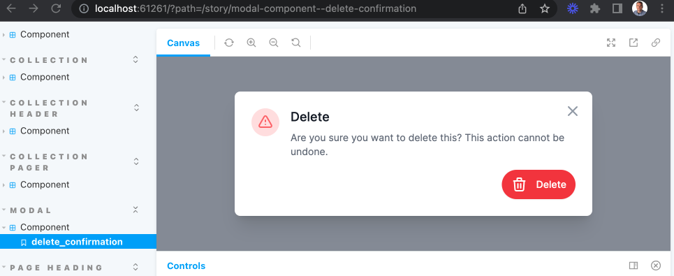
And here is how it is rendered in the edit.html.erb:
<%= render Modal::Component.new(name: :item_sell_packs_delete_confirmation) do |modal| %>
  <%= modal.with_confirmation(
          title: 'Delete',
          icon_options: { name: :exclamation, colour: :red, options: { classes: '' } },
          message: 'Are you sure you want to delete this? This action cannot be undone.'
      ) %>
  <% modal.with_button(
         id: :confirm_delete,
         label: 'Delete',
         options: {
             icon: { name: :trash, colour: :white },
             colour_classes: 'text-white bg-red-500 hover:bg-red-600 focus:ring-red-200',
             data: {
                 params: [
                     { name: 'resource-id', value: @resource.id },
                     { name: 'resource-url', value: polymorphic_path(@resource_class) },
                     { name: 'resource-modal-name', value: :item_sell_packs_delete_confirmation }
                 ],
                 action: 'click->resource#delete'
             }
         }) %>
<% end %>
Back to the resources controller the confirmDelete method sets a data param on the delete button so that the "Delete" button on the confirmation can then call the delete method with the id of the resource to be deleted. Finally it shows the modal.
    confirmDeleteButton.data('resource-id-param', resourceId)
    modal.show()
The delete method closes the modal and calls destroy on the server to actually delete the record. The response contains a location to redirect to afterwards, in my case it is the index page.
    modal.hide()
    const res = await destroy(`${resourceUrl}/${resourceId}`, { responseKind: 'json' })
    if (res.response.ok) {
      window.location = resourceUrl
    }
On the server side a small change needed to be made to the destroy method in order to display a message to the user that their deletion was successful. Because the Request.JS call is via XHR and JSON no flash notice was being set. I can do that in the format.json block.
  def destroy
    @resource.destroy!

    respond_to do |format|
      format.html { redirect_to(collection_url, notice: "#{resource_human_name} was successfully destroyed.") }
      format.json do
        flash[:notice] = "#{resource_human_name} was successfully destroyed."
        head(:no_content)
      end
      format.turbo_stream {}
    end
  end
The last thing I want to add for this part are "View" and "Delete" buttons on the index page, like so:
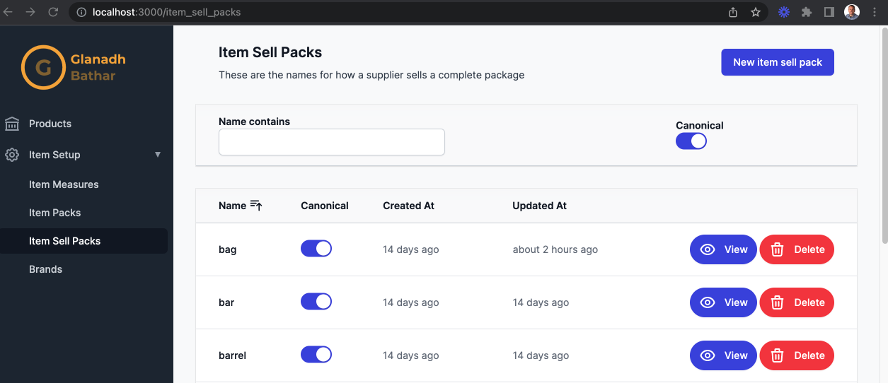
These use all the same components as previously mentioned. One small difference on the confirmation modal is that the "Delete" button on there calls the inlineDelete method in the resources controller instead. This method passes in { responseKind: 'turbo-stream' } to destroy, telling the server that it should respond with a turbo stream instead.
  inlineDelete(event) {
    ...
    modal.hide()
    destroy(`${resourceUrl}/${resourceId}`, { responseKind: 'turbo-stream' })
  }
So what does that response look like? Here is the destroy.turbo_stream.erb file:
<%= turbo_stream_action_tag("remove", target: dom_id(@resource, "turbo_stream")) %>
This is telling Turbo that it should remove the content where the target matches the given id. That id is being set when rendering the rows on the index page:
<%= rows_component.with_row(id: dom_id(resource, "turbo_stream")) do |rc| %>
Useful links:
https://medium.com/rubyinside/a-deep-dive-into-csrf-protection-in-rails-19fa0a42c0ef
https://github.com/rails/requestjs-rails
https://github.com/rails/requestjs-rails
https://github.com/pantographe/view_component-form


