Dropdown/Select component using ViewComponent and Hotwire
One possible way of rendering a simple dropdown or selection control

I am a web developer who has been in the industry since 1995. My current tech stack preference is Ruby on Rails with JavaScript. Originally from Australia but now living in Scotland.
TailwindUI has something they call a Select Menu component which will be the basis for what I am calling a Dropdown component. Here is my Storybook entry for the finished component:
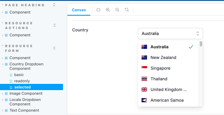
And here is the component in action for two different types of dropdowns, one for selecting a Locale and another for a Country.
Note that this component is not full featured. At this stage all I am supporting is displaying a fixed set of options, there is no ability to do an autocomplete to another source, a backend server for example. And the only keyboard controls are arrow up, arrow down and enter for selecting an option. In the future I may add support for looking for the first option that matches a given keystroke.
The first thing to do is build a ViewComponent. Here is the Ruby code for a generic dropdown:
app/components/resource_form/dropdown_component.rb
module ResourceForm
  class DropdownComponent < BaseComponent
    # @return [Array<Hash>] the items to display in the dropdown
    attr_reader :items
    # @return [String] the currently selected value
    attr_reader :selected_value
    # @return [Boolean] true if the items list is hidden, false otherwise
    attr_reader :hidden

    # @param [Array<Hash>] items the selectable elements to display in the dropdown.
    #   The hash should contain `text`, `value` and optionally a `css` class list
    #   Example:  `{ text: 'English (GB)', value: 'en-GB', css: 'fi fi-gb' }`
    def initialize(attribute:, label:, resource:, items:, hidden: true, options: {})
      super(attribute: attribute, label: label, resource: resource, options: options)
      @items = items
      @selected_value = resource.send(attribute)
      @hidden = hidden
    end

    private

    def selected?(value:)
      selected_value == value
    end

    def selected_text
      selected_item&.dig(:text)
    end

    def selected_item
      items.find { |o| o[:value] == selected_value }
    end
  end
end
Upon creation the component is expecting to receive a resource and an attribute for that resource. Using this the component can determine if there is a selected value it needs to display. The other important parameter is the items. This should be an array of hashes containing text and value. It may also optionally contain a css fragment for putting an icon next to the item.
An example:
[
        { text: 'English (GB)', value: 'en-GB', css: 'fi fi-gb' },
        { text: 'English (US)', value: 'en-US', css: 'fi fi-us' }
]
This component inherits from a BaseComponent which I use for all of my resource based input components:
app/components/resource_form/base_component.rb
module ResourceForm
  class BaseComponent < ViewComponent::Base
    include IconsHelper

    # @return [String] the model attribute
    attr_reader :attribute
    # @return [String] the label for the field
    attr_reader :label
    # @return [ActiveRecord] the resource to retrieve the attribute from
    attr_reader :resource
    # @return [Hash] the additional configuration options for the field
    attr_reader :options

    # @param [String] attribute model attribute to either display or provide an input for
    # @param [String] label a label for the field, must have i18n already applied
    # @param [ActiveRecord] resource an instance of an ActiveRecord object to read data from
    # @param [Hash] options additional configuration options for the field
    # @option options [String] :help a message to place near the label to help the user understand the attribute
    # @option options [Boolean] :readonly is this attribute currently editable?
    # @option options [Boolean] :editable is this attribute ever editable?
    # @option options [Boolean] :required is this attribute required to have a value?
    # @option options [String] :invalid_message if this field is invalid what message to display
    # @option options [String] :url will convert display to be link to another page
    def initialize(attribute:, label:, resource:, options: {})
      super
      @attribute = attribute
      @label = label
      @resource = resource
      @options = options.reverse_merge!(default_field_options)
    end

    private

    def default_field_options
      { help: nil, readonly: true, editable: true, required: false }
    end

    def field_id
      "#{resource.model_name.singular}_#{resource.id || 'new'}_#{attribute}"
    end

    def field_name
      "#{resource.model_name.singular}[#{attribute}]"
    end

    def display_only?
      @options[:readonly] || !@options[:editable]
    end

    def required?
      @options[:required]
    end

    def invalid_message
      @options[:invalid_message]
    end

    def url
      @options[:url]
    end

    def help
      @options[:help]
    end
  end
end
Next is the HTML for the component:
app/components/resource_form/dropdown_component.html.erb
<div class="sm:grid sm:grid-cols-3 sm:gap-4 sm:items-start sm:border-t sm:border-gray-200 sm:pt-5" data-controller="resource-form--component">
  <div>
    <label id="<%= field_id %>--label" for="<%= field_id %>" class="block text-sm font-medium text-gray-700 sm:mt-px sm:pt-">
      <%= label %>
    </label>
    <% if help.present? %>
      <div id="<%= field_id %>--help" class="mt-2 text-sm text-gray-300 inline-flex items-center">
        <%= icon(name: :question_mark_circle, colour: :blue, options: { size: 5 }) %><%= help %>
      </div>
    <% end %>
  </div>
  <div
    class="mt-1 sm:mt-0 sm:col-span-2"
    data-controller="resource-form--dropdown-component"
    data-resource-form--dropdown-component-item-list-id-value="<%= field_id %>--item-list"
    data-resource-form--dropdown-component-hidden-input-id-value="<%= field_id %>--hidden-input"
    data-resource-form--dropdown-component-input-id-value="<%= field_id %>--input"
  >
    <div class="flex items-center">
      <div class="relative mt-1">
        <input id="<%= field_id %>--input" value="<%= selected_text %>" disabled type="text" class="w-full rounded-md border border-gray-300 bg-white py-2 pl-3 pr-12 shadow-sm focus:border-sky-500 focus:outline-none focus:ring-1 focus:ring-sky-500 sm:text-sm" role="combobox" aria-controls="options" aria-expanded="false">
        <input id="<%= field_id %>--hidden-input" value="<%= selected_value %>" type="hidden" name="<%= field_name %>">
        <% unless display_only? %>
          <button
            id="<%= field_id %>--button"
            type="button"
            class="absolute inset-y-0 right-0 flex items-center rounded-r-md px-2 focus:outline-none"
            data-action="click->resource-form--dropdown-component#toggle keydown->resource-form--dropdown-component#handleKeydown"
          >
            <!-- Heroicon name: mini/chevron-up-down -->
            <svg class="h-5 w-5 text-gray-400" xmlns="http://www.w3.org/2000/svg" viewBox="0 0 20 20" fill="currentColor" aria-hidden="true">
              <path fill-rule="evenodd" d="M10 3a.75.75 0 01.55.24l3.25 3.5a.75.75 0 11-1.1 1.02L10 4.852 7.3 7.76a.75.75 0 01-1.1-1.02l3.25-3.5A.75.75 0 0110 3zm-3.76 9.2a.75.75 0 011.06.04l2.7 2.908 2.7-2.908a.75.75 0 111.1 1.02l-3.25 3.5a.75.75 0 01-1.1 0l-3.25-3.5a.75.75 0 01.04-1.06z" clip-rule="evenodd" />
            </svg>
          </button>
        <% end %>

        <ul id="<%= field_id %>--item-list" <%= 'hidden' if hidden %> class="absolute z-10 mt-1 max-h-56 w-full overflow-auto rounded-md bg-white py-1 text-base shadow-lg ring-1 ring-black ring-opacity-5 focus:outline-none sm:text-sm" id="options" role="listbox">
          <!--
            Combobox option, manage highlight styles based on mouseenter/mouseleave and keyboard navigation.

            Active: "text-white bg-sky-600", Not Active: "text-gray-900"
          -->
          <% items.each_with_index do |item, index| %>
            <li
              class="relative cursor-default select-none py-2 pl-3 pr-9 text-gray-900 dropdown-component__option"
              id="<%= field_id %>--item-<%= index %>"
              data-resource-form--dropdown-component-item-value-param="<%= item[:value] %>"
              data-resource-form--dropdown-component-item-text-param="<%= item[:text] %>"
              data-resource-form--dropdown-component-checkmark-id-param="<%= field_id %>--<%= item[:value] %>-checkmark"
              data-action="mouseenter->resource-form--dropdown-component#highlight mouseleave->resource-form--dropdown-component#highlight click->resource-form--dropdown-component#select"
              role="option"
              tabindex="-1"
            >
              <div id="<%= field_id %>--<%= item[:value] %>-value" class="flex items-center">
                <% if item[:css] %>
                  <span class="flex-none <%= item[:css] %>"></span>
                <% end %>
                <!-- Selected: "font-semibold" -->
                <span
                  class="ml-3 truncate <%= 'font-semibold' if selected?(value: item[:value]) %>"
                  title="<%= item[:text] %>">
                  <%= item[:text] %>
                </span>
              </div>

              <!--
                Checkmark, only display for selected option.

                Active: "text-white", Not Active: "text-sky-600"
              -->
              <span
                id="<%= field_id %>--<%= item[:value] %>-checkmark"
                data-resource-form--dropdown-component-target="checkmark"
                class="<%= 'hidden' unless selected?(value: item[:value]) %> absolute inset-y-0 right-0 flex items-center pr-4 text-sky-600">
                <!-- Heroicon name: mini/check -->
                <svg class="h-5 w-5" xmlns="http://www.w3.org/2000/svg" viewBox="0 0 20 20" fill="currentColor" aria-hidden="true">
                  <path fill-rule="evenodd" d="M16.704 4.153a.75.75 0 01.143 1.052l-8 10.5a.75.75 0 01-1.127.075l-4.5-4.5a.75.75 0 011.06-1.06l3.894 3.893 7.48-9.817a.75.75 0 011.05-.143z" clip-rule="evenodd" />
                </svg>
              </span>
            </li>
          <% end %>
        </ul>
      </div>
    </div>
  </div>
</div>
They key points of interest from this are:
A div element that attaches a Stimulus controller and also stores ids for various other elements in the component so they can be targeted by the TypeScript code.
  <div
    data-controller="resource-form--dropdown-component"
    data-resource-form--dropdown-component-item-list-id-value="<%= field_id %>--item-list"
    data-resource-form--dropdown-component-hidden-input-id-value="<%= field_id %>--hidden-input"
    data-resource-form--dropdown-component-input-id-value="<%= field_id %>--input"
  >
A text input that will show a selected item's "display" text.
<input id="<%= field_id %>--input" value="<%= selected_text %>" disabled type="text" ...>
A hidden input that will store the value for a selected item.
<input id="<%= field_id %>--hidden-input" value="<%= selected_value %>" type="hidden" name="<%= field_name %>">
A ul element that will start as hidden initially, this contains all the items that can be selected.
<ul id="<%= field_id %>--item-list" <%= 'hidden' if hidden %> ...>
A li element that is something that can be selected. Note that it has a class called "dropdown-component__option". This will be used to help find all the possible options later in the Stimulus controller. It also has some Stimulus parameters and actions attached to it.
<li
    class="relative cursor-default select-none py-2 pl-3 pr-9 text-gray-900 dropdown-component__option"
    id="<%= field_id %>--item-<%= index %>"
    data-resource-form--dropdown-component-item-value-param="<%= item[:value] %>"
    data-resource-form--dropdown-component-item-text-param="<%= item[:text] %>"
    data-resource-form--dropdown-component-checkmark-id-param="<%= field_id %>--<%= item[:value] %>-checkmark"
    data-action="mouseenter->resource-form--dropdown-component#highlight mouseleave->resource-form--dropdown-component#highlight click->resource-form--dropdown-component#select"
    ...
>
A span element used to show a checkmark next to the currently selected item. Note that it has a Stimulus target specified against it.
<span
    id="<%= field_id %>--<%= item[:value] %>-checkmark"
    data-resource-form--dropdown-component-target="checkmark"
    class="<%= 'hidden' unless selected?(value: item[:value]) %> absolute inset-y-0 right-0 flex items-center pr-4 text-sky-600">
    ...
</span>
Now for the Stimulus controller:
app/components/resource_form/dropdown_component_controller.ts
import {ActionEvent, Controller} from "@hotwired/stimulus"
import cash, { Cash } from "cash-dom"

export default class extends Controller {
    static values = {
        inputId: String,
        hiddenInputId: String,
        itemListId: String
    }
    static targets = ["checkmark"]

    declare readonly inputIdValue: string;
    declare readonly hiddenInputIdValue: string;
    declare readonly itemListIdValue: string;
    declare readonly checkmarkTarget: HTMLElement;
    declare readonly checkmarkTargets: HTMLElement[];

    // Toggle visibility of the item list
    toggle(event: ActionEvent) {
        event.preventDefault()
        const dropdownEl: HTMLElement = cash(`#${this.itemListIdValue}`)[0] as HTMLElement
        dropdownEl.toggleAttribute('hidden')
    }

    // Highlight an individual item from the list
    highlight(event: ActionEvent) {
        const targetEl: HTMLElement = event.target as HTMLElement
        const listItemEl = cash(`#${targetEl.id}`)
        const checkmarkEl = cash(`#${event.params.checkmarkId}`)
        listItemEl.toggleClass('text-gray-900 text-white bg-gray-900 bg-sky-600 dropdown-component__option--highlighted')
        checkmarkEl.toggleClass('text-white text-sky-600')
    }

    // Set the value of the associated inputs to the item a user has selected
    select(event: ActionEvent) {
        const checkmarkEl: HTMLElement | null = document.querySelector(`#${event.params.checkmarkId}`)
        const inputEl: HTMLInputElement | null = document.querySelector(`#${this.inputIdValue}`)
        const hiddenInputEl: HTMLInputElement | null = document.querySelector(`#${this.hiddenInputIdValue}`)
        const value: string = event.params.itemValue
        const text: string = event.params.itemText

        if (inputEl && hiddenInputEl) {
            // Set the input values
            inputEl.value = text
            hiddenInputEl.value = value

            // Deselect any currently selected item
            this.checkmarkTargets.forEach(function (checkmark) {
                checkmark.classList.add('hidden')
            })

            // Select this item
            if (checkmarkEl) {
                checkmarkEl.classList.remove('hidden')
            }

            // Hide the dropdown
            this.toggle(event)
        }
    }

    // Handle supported keydown events
    handleKeydown(event: ActionEvent & KeyboardEvent) {
        event.preventDefault()
        const dropdownEl = cash(`#${this.itemListIdValue}`)
        const highlightedItems = dropdownEl.children('li.dropdown-component__option--highlighted')
        const currentItem = highlightedItems[0]
        let nextItem: HTMLElement | undefined

        if (event.key === 'Enter') {
            this.handleEnter(currentItem)
            return
        }
        if (event.key === 'ArrowDown') {
            nextItem = this.getNextItem(highlightedItems, dropdownEl)
        }
        if (event.key === 'ArrowUp') {
            nextItem = this.getPreviousItem(highlightedItems, dropdownEl)
        }
        // In future handle other keys

        this.triggerHighlight(nextItem, currentItem)
    }

    // Get the next item that can be highlighted
    getNextItem(highlightedItems: Cash, dropdownEl: Cash): HTMLElement {
        if (highlightedItems.length > 0) {
            return highlightedItems.next('li.dropdown-component__option')[0] as HTMLElement
        } else {
            return dropdownEl.find('li.dropdown-component__option')[0] as HTMLElement
        }
    }

    // Get the previous item that can be highlighted
    getPreviousItem(highlightedItems: Cash, dropdownEl: Cash) {
        if (highlightedItems.length > 0) {
            return highlightedItems.prev('li.dropdown-component__option')[0] as HTMLElement
        } else {
            return dropdownEl.find('li.dropdown-component__option')[0] as HTMLElement
        }
    }

    // Select the element the user has highlighted (if there is one)
    handleEnter(currentItem: HTMLElement | undefined) {
        if (currentItem) {
            currentItem.dispatchEvent(new Event('click'))
        }
    }

    // Trigger highlighting on the next item and remove it from the current item
    triggerHighlight(nextItem: HTMLElement | undefined, currentItem: HTMLElement | undefined) {
        if (nextItem) {
            // mouseenter to trigger highlighting
            nextItem.dispatchEvent(new Event('mouseenter'))
        }
        if (nextItem && currentItem) {
            // mouseleave to trigger highlight removal (but only if the user has not reached the last option)
            currentItem.dispatchEvent(new Event('mouseleave'))
        }
    }
}
The key points of interest from this controller then are:
Values here are ids of specific elements in the control, for example the hiddenInputId is used to find the input element when selecting a value. The checkmark targets are used when adding and removing highlights on items in the list.
static values = {
        inputId: String,
        hiddenInputId: String,
        itemListId: String
}
static targets = ["checkmark"]
Using the next and prev functionality of cash-dom to find a list item to highlight. The previously mentioned css class dropdown-component_option is used to mark what are valid targets for this.
return highlightedItems.next('li.dropdown-component__option')[0] as HTMLElement
return highlightedItems.prev('li.dropdown-component__option')[0] as HTMLElement
When a user presses enter on a highlighted item I dispatch a click event so it has the same behaviour as a user clicking on it with a mouse.
handleEnter(currentItem: HTMLElement | undefined) {
    if (currentItem) {
        currentItem.dispatchEvent(new Event('click'))
    }
}
So how can I use one of these new Dropdown components? Because I am using polymorphic ViewComponent slots I need to add my new Dropdown component to the list of possibilities:
app/components/resource_form/field_component.rb
module ResourceForm
  class FieldComponent < ViewComponent::Base
    include IconsHelper

    renders_one :attribute, types: {
      text: ResourceForm::TextComponent,
      toggle: ResourceForm::ToggleComponent,
      timestamp: ResourceForm::TimestampComponent,
      hidden: ResourceForm::HiddenComponent,
      image: ResourceForm::ImageComponent,
      dropdown: ResourceForm::DropdownComponent,
    }
  end
end
And then on a form that I want to present a Dropdown for options on I can add one of these new field component types for my Dropdown:
    <% component.with_field do |c| %>
      <% c.with_attribute_dropdown(
             attribute: :option,
             label: resource_class.human_attribute_name(:option),
             resource: resource,
             items: [{text: 'Option A', value: 'A'}, {text: 'Option B', value: 'B'}],
             options: { readonly: readonly, help: t('.help.option') }
         ) %>
    <% end %>
However, another possibility exists that encapsulates things a bit better. Let's assume I want a Dropdown for locales, such as en-GB, th, zh etc. Instead of using the generic Dropdown component and passing in the items each time I can build a new ViewComponent specifically for handling locales:
app/components/resource_form/locale_dropdown_component.rb
module ResourceForm
  class LocaleDropdownComponent < BaseComponent
    # @return [Boolean] true if the items list is hidden, false otherwise
    attr_reader :hidden

    def initialize(attribute:, label:, resource:, hidden: true, options: {})
      super(attribute: attribute, label: label, resource: resource, options: options)
      @hidden = hidden
    end

    private

    def locales
      supported_locales.map { |l| { text: l[:name], value: l[:alpha2], css: "fi fi-#{l[:flag]}" } }
    end

    def supported_locales
      [
        { name: 'English (GB)', alpha2: 'en-GB', flag: 'gb' },
        { name: 'English (US)', alpha2: 'en-US', flag: 'us' },
        { name: 'Thai', alpha2: 'th', flag: 'th' },
        { name: 'Chinese', alpha2: 'zh', flag: 'cn' }
      ]
    end
  end
end
Note that I'm not inheriting from the original Dropdown component. GitHub recommends against this approach (see here), so instead I'm using composition. The Locale component renders a regular Dropdown component but has its own method for producing the items array.
app/components/resource_form/locale_dropdown_component.html.erb
<%= render ResourceForm::DropdownComponent.new(
    attribute: attribute, label: label, resource: resource, items: locales, hidden: hidden, options: options) %>
Now I can use this fully encapsulated Locale dropdown anywhere I need it, and it already knows how to generate all the locales I support:
    <% component.with_field do |c| %>
      <% c.with_attribute_locale_dropdown(
             attribute: :locale,
             label: resource_class.human_attribute_name(:locale),
             resource: resource,
             options: { readonly: readonly, help: t('.help.locale') }
         ) %>
    <% end %>
Here's what it looks like:
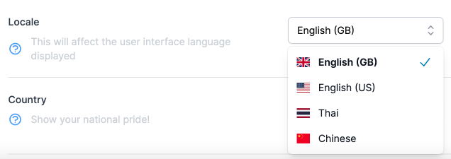
And that wraps it up for this Dropdown component (for now). If I add future functionality to it I will update this page.


