Displaying audit logs
Part 27 of building a Rails 7 application

I am a web developer who has been in the industry since 1995. My current tech stack preference is Ruby on Rails with JavaScript. Originally from Australia but now living in Scotland.
Way back in Part 8 I spoke about adding auditing to this application. I used the audited gem to provide the functionality for tracking changes. Now I want to display those audit logs to the users.
This is going to introduce a couple challenges from a User Interface and controller perspective. Firstly, an audit log has a polymorphic association with the "thing" being audited so I'll need to support showing these records for any kind of parent record. Secondly there are some filtering options I don't support yet, one of those being picking a date range and another is choosing one or more options from a fixed list.
Here is the end result in action:
Back to the first challenge which is how to show nested records when it is not known what the parent class will be. Back in Part 24 I had addressed this situation when nesting the alias records under the item sell packs. This solution goes most of the way but needs a bit of tweaking. Here is the new implementation of those methods for the AuditsController.
app/controllers/audits_controller.rb
  def parent_class
    @parent_class ||= parameter_introspection.id_param_class
  end

  def parent
    @parent ||= parameter_introspection.id_param_instance
  end

  def parent_param
    parameter_introspection.id_param
  end

  private

  def parameter_introspection
    @parameter_introspection ||= ::ParameterIntrospection.new(parameters: params)
  end
The parent_class and parent methods have been changed to use this new class I've called the ParameterIntrospection. This class is responsible for looking at the parameters that have been passed into the controller and find any that could be representing a "parent" object. I'm doing this by picking the first parameter that matches <something>_id.
app/lib/parameter_introspection.rb
class ParameterIntrospection
  attr_reader :parameters

  def initialize(parameters:)
    @parameters = parameters
  end

  def id_param
    parameters.each_key.find { |key| /_id$/.match(key) }
  end

  def id_param_class
    id_param.gsub('_id', '').classify.safe_constantize
  end

  def id_param_instance
    id_param_class.find_by(id: parameters[id_param])
  end
end
Here is an example of an actual call to the controller:
21:24:53 web.1  | Processing by AuditsController#index as HTML
21:24:53 web.1  |   Parameters: {"q"=>{"action_in"=>["create"], "created_at_gteq"=>"", "created_at_lteq"=>""}, "item_sell_pack_id"=>"2"}
From here the ParameterIntrospection finds the item_sell_pack_id and from that can deduce that the parent is of class ItemSellPack and the id is 2. This now allows the controller to return the correct set of audits for that instance. I'm using own_and_associated_audits so that when I'm looking at something like the ItemSellPack the user will also see any changes to the child records for that (e.g. the ItemSellPackAlias).
app/controllers/audits_controller.rb
  def collection_path_method
    return super unless nested?

    :"#{parent_class.name.underscore}_audits_path"
  end

  def set_filters
    return super unless nested?

    @q = parent.own_and_associated_audits.ransack((params[:q] || {}).reverse_merge(default_filters))
  end

  def default_filters
    {}
  end

  def filter_url
    return unless nested?

    @filter_url ||= public_send(collection_path_method, { parent_param => parent })
  end
So now I'm able to get the correct set of records to display I can add in a new Tab in the navigation for the user to view them. The tab is also showing how many audit logs there are using the badge.
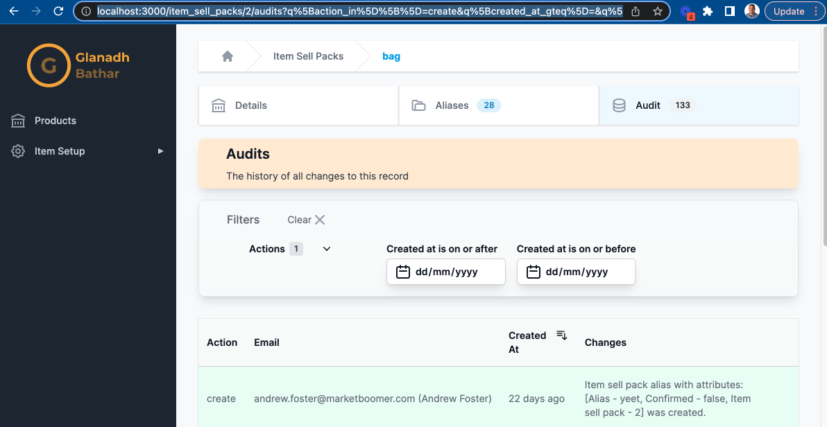
Prior to this blog the only options available for filtering were toggling a boolean and searching for text contained within a field. For this audit logs page it makes more sense to filter by a date range and also a type of audit (called an "action" by audited).
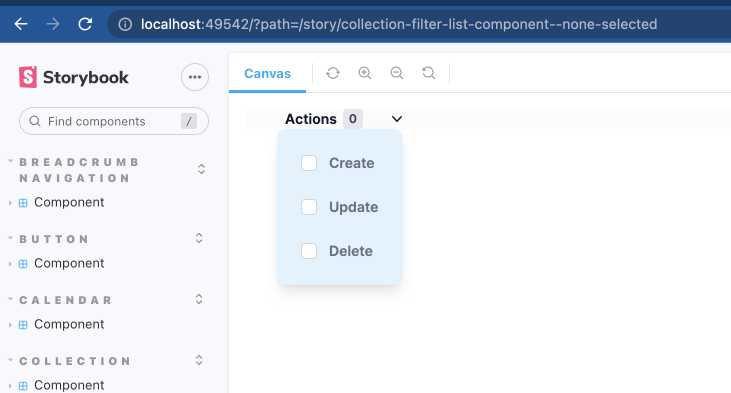
I'll start with what I'm going to call a "List" component. It gives a fixed set of options with check boxes next to each allowing for the selection of more than one option. Here's the Storybook version of it:
The component takes a few parameters, the attribute to be filtered on and arrays for the options.
app/components/collection_filter/list_component.rb
module CollectionFilter
  class ListComponent < ViewComponent::Base
    # @return [String] the label for the filter
    attr_reader :label
    # @return [Symbol] the name of the attribute to filter on
    attr_reader :attribute
    # @return [Array<Hash>] the display and value for 1 or more list options
    attr_reader :options
    # @return [Array<String>] the currently selected options
    attr_reader :selected_options
    # @return [Boolean] true if the options component is hidden, false otherwise
    attr_reader :hidden

    def initialize(label:, attribute:, options: [], selected_options: [], hidden: true)
      super
      @label = label
      @attribute = attribute
      @options = options
      @selected_options = selected_options || []
      @hidden = hidden
    end

    private

    def option_checked(value:)
      selected_options.include?(value)
    end
  end
end
The component will iterate the options, marking them as checked if the user has already selected them and gives a button to open/close the list of options.
app/components/collection_filter/list_component.html.erb
<div class="sticky top-0 z-10 bg-gray-50 bg-opacity-75 pl-4 pr-3 text-left text-sm font-semibold text-gray-900 backdrop-blur backdrop-filter sm:pl-6 lg:pl-8">
  <div
    class="mr-6 px-2 w-full text-sm flex items-center cursor-pointer"
    aria-controls="filter-section-0"
    aria-expanded="false"
    data-controller="collection-filter--list-component"
    data-action="click->collection-filter--list-component#toggle"
    data-collection-filter--list-component-attribute-value="<%= attribute %>"
  >
    <span id="<%= attribute %>_list--label" class="text-gray-900"> <%= label %> </span>
    <span id="<%= attribute %>_list--count" class="ml-1.5 rounded py-0.5 px-1.5 bg-gray-200 text-xs font-semibold text-gray-700 tabular-nums">
      <%= selected_options.size %>
    </span>
    <span class="ml-6 flex">
      <svg id="<%= attribute %>_list--toggle_button" class="rotate-0 h-5 w-5 transform" xmlns="http://www.w3.org/2000/svg" viewBox="0 0 20 20" fill="currentColor" aria-hidden="true">
        <path fill-rule="evenodd" d="M5.23 7.21a.75.75 0 011.06.02L10 11.168l3.71-3.938a.75.75 0 111.08 1.04l-4.25 4.5a.75.75 0 01-1.08 0l-4.25-4.5a.75.75 0 01.02-1.06z" clip-rule="evenodd"/>
      </svg>
    </span>
  </div>
  <div id="<%= attribute %>_list--options" class="pt-6 absolute z-20 rounded-lg shadow-lg bg-sky-100 p-6" id="filter-section-0" <%= 'hidden' if hidden %>>
    <div class="space-y-6" data-controller="collection-filter--list-component">
      <% options.each_with_index do |option, index| %>
        <div class="flex items-center">
          <input
            id="<%= attribute %>_list--option_<%= index %>"
            name="q[<%= attribute %>_in][]"
            value="<%= option[:value] %>"
            type="checkbox"
            <%= 'checked' if option_checked(value: option[:value]) %>
            class="h-4 w-4 border-gray-300 rounded text-indigo-600 focus:ring-indigo-500"
            data-action="change->collection-filter--list-component#selectOption select->collection-filter--component#filter"
          >
          <label for="<%= attribute %>_list--option_<%= index %>" class="ml-3 text-sm text-gray-500"> <%= option[:text] %> </label>
        </div>
      <% end %>
    </div>
  </div>
</div>
The Stimulus controller is pretty basic, it has a method for toggling whether the options list is visible or not and if the user picks an option a "select" event is dispatched which will then trigger the filter form to be submitted so the new results are displayed.
app/components/collection_filter/list_component_controller.ts
import {ActionEvent, Controller} from "@hotwired/stimulus"
import cash, {Cash} from "cash-dom";

export default class extends Controller {
    static values = {
        attribute: String
    }

    declare readonly attributeValue: string;

    toggle(event: ActionEvent) {
        event.preventDefault()
        const optionsButton: Cash = cash(`#${this.attributeValue}_list--toggle_button`)
        const containerEl: HTMLElement = cash(`#${this.attributeValue}_list--options`)[0] as HTMLElement
        containerEl.toggleAttribute('hidden')
        optionsButton.toggleClass('-rotate-180 rotate-0')
    }

    selectOption(event: ActionEvent) {
        const targetEl: HTMLElement = event.target as HTMLElement

        if (targetEl) {
            targetEl.dispatchEvent(new Event('select'))
        }
    }
}
The last one I need is a component for selecting a range of dates. It should cope with choosing only the "From" and the "To" as well but if both are chosen the "From" should be less than or equal to the "To".
Here is the Storybook preview of what it will look like:
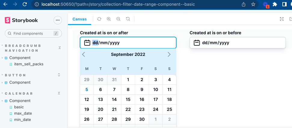
This component is very simple indeed because most of the logic resides in the Calendar component of which this component uses two, one for the start of the date range and one for the end of the date range. For details on the implementation of a Calendar component see here.
app/components/collection_filter/date_range_component.rb
module CollectionFilter
  # Two date fields representing a "from" and "to" date range to filter on
  # @todo Prevent from date > to date
  class DateRangeComponent < ViewComponent::Base
    include Turbo::FramesHelper

    # @return [Symbol] the name of the attribute to filter on
    attr_reader :attribute
    # @return [String] the start of the date range
    attr_reader :from_date
    # @return [String] the end of the date range
    attr_reader :to_date

    def initialize(attribute:, from_date: '', to_date: '')
      super
      @attribute = attribute
      @from_date = from_date
      @to_date = to_date
    end

    def from_calendar_url
      "/calendar?id=#{attribute}_from&input_id=q_#{attribute}_gteq&selected_date=#{from_date}&max_date=#{to_date}&hidden=true"
    end

    def to_calendar_url
      "/calendar?id=#{attribute}_to&input_id=q_#{attribute}_lteq&selected_date=#{to_date}&min_date=#{from_date}&hidden=true"
    end
  end
end
The HTML has two date inputs for capturing the result of selecting a date from the calendar. A user can also manually enter a date. The date inputs take care of a number of validations automatically, preventing users from entering non digits or using invalid dates. The format is also shown based on whatever the user's current browser location is. Additional validation to ensure the from date is not after the to date and vice versa also gives a better user experience.
app/components/collection_filter/date_range_component.html.erb
<div class="sticky top-0 z-10 bg-gray-50 bg-opacity-75 pl-4 pr-3 text-left text-sm font-semibold text-gray-900 backdrop-blur backdrop-filter sm:pl-6 lg:pl-8">
  <div class="grid grid-cols-2 gap-4" data-controller="calendar--component">
    <div>
      <label for="q_<%= attribute %>_gteq"><%= "#{attribute.to_s.humanize} is on or after" %></label>
      <div class="mt-1 w-80 relative rounded-md" data-action="click->calendar--component#toggle" data-calendar--component-toggle-calendar-id-param="<%= attribute %>_from_calendar">
        <div class="absolute inset-y-0 left-0 pl-3 flex items-center pointer-events-none">
          <svg xmlns="http://www.w3.org/2000/svg" class="h-6 w-6" fill="none" viewBox="0 0 24 24" stroke="currentColor" stroke-width="2">
            <path stroke-linecap="round" stroke-linejoin="round" d="M8 7V3m8 4V3m-9 8h10M5 21h14a2 2 0 002-2V7a2 2 0 00-2-2H5a2 2 0 00-2 2v12a2 2 0 002 2z"/>
          </svg>
        </div>
        <input
          autocomplete="off"
          class="max-w-lg pl-10 block w-full shadow-lg focus:ring-sky-500 focus:border-sky-500 sm:max-w-xs sm:text-sm border-gray-300 rounded-md"
          data-action="keydown->collection-filter--component#filter select->collection-filter--component#filter"
          value="<%= from_date %>"
          max="<%= to_date %>"
          type="date"
          name="q[<%= attribute %>_gteq]"
          id="q_<%= attribute %>_gteq"
        >
      </div>
      <%= turbo_frame_tag "#{attribute}_from", src: from_calendar_url, loading: :lazy do %>
        <%= render Calendar::Component.new(id: "#{attribute}_from", year: '', month: '', input_id: "q_#{attribute}_gteq", selected_date: from_date, max_date: to_date, hidden: true) %>
      <% end %>
    </div>
    <div>
      <label for="q_<%= attribute %>_lteq"><%= "#{attribute.to_s.humanize} is on or before" %></label>
      <div class="mt-1 w-80 relative rounded-md" data-action="click->calendar--component#toggle" data-calendar--component-toggle-calendar-id-param="<%= attribute %>_to_calendar">
        <div class="absolute inset-y-0 left-0 pl-3 flex items-center pointer-events-none">
          <svg xmlns="http://www.w3.org/2000/svg" class="h-6 w-6" fill="none" viewBox="0 0 24 24" stroke="currentColor" stroke-width="2">
            <path stroke-linecap="round" stroke-linejoin="round" d="M8 7V3m8 4V3m-9 8h10M5 21h14a2 2 0 002-2V7a2 2 0 00-2-2H5a2 2 0 00-2 2v12a2 2 0 002 2z"/>
          </svg>
        </div>
        <input
          autocomplete="off"
          class="max-w-lg pl-10 block w-full shadow-lg focus:ring-sky-500 focus:border-sky-500 sm:max-w-xs sm:text-sm border-gray-300 rounded-md"
          data-action="keydown->collection-filter--component#filter select->collection-filter--component#filter"
          value="<%= to_date %>"
          min="<%= from_date %>"
          type="date"
          name="q[<%= attribute %>_lteq]"
          id="q_<%= attribute %>_lteq"
        >
      </div>
      <%= turbo_frame_tag "#{attribute}_to", src: to_calendar_url, loading: :lazy do %>
        <%= render Calendar::Component.new(id: "#{attribute}_to", year: '', month: '', input_id: "q_#{attribute}_lteq", selected_date: to_date, min_date: from_date, hidden: true) %>
      <% end %>
    </div>
  </div>
</div>
And that wraps up this section, introducing two new filter components I can use elsewhere and support for viewing polymorphic has_many's to a controller.


