


Photo by César Couto on Unsplash
Dropdown/Select component using ViewComponent and Hotwire
One possible way of rendering a simple dropdown or selection control


TailwindUI has something they call a Select Menu component which will be the basis for what I am calling a Dropdown component. Here is my Storybook entry for the finished component:
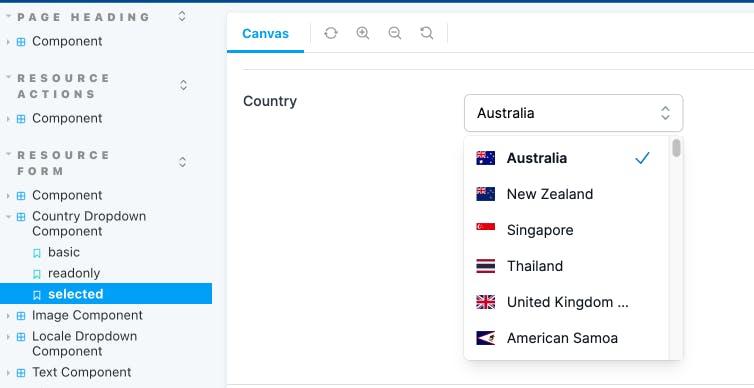
And here is the component in action for two different types of dropdowns, one for selecting a Locale and another for a Country.
Note that this component is not full featured. At this stage all I am supporting is displaying a fixed set of options, there is no ability to do an autocomplete to another source, a backend server for example. And the only keyboard controls are arrow up, arrow down and enter for selecting an option. In the future I may add support for looking for the first option that matches a given keystroke.
The first thing to do is build a ViewComponent. Here is the Ruby code for a generic dropdown:
app/components/resource_form/dropdown_component.rb
module ResourceForm
  class DropdownComponent < BaseComponent
    # @return [Array<Hash>] the items to display in the dropdown
    attr_reader :items
    # @return [String] the currently selected value
    attr_reader :selected_value
    # @return [Boolean] true if the items list is hidden, false otherwise
    attr_reader :hidden

    # @param [Array<Hash>] items the selectable elements to display in the dropdown.
    #   The hash should contain `text`, `value` and optionally a `css` class list
    #   Example:  `{ text: 'English (GB)', value: 'en-GB', css: 'fi fi-gb' }`
    def initialize(attribute:, label:, resource:, items:, hidden: true, options: {})
      super(attribute: attribute, label: label, resource: resource, options: options)
      @items = items
      @selected_value = resource.send(attribute)
      @hidden = hidden
    end

    private

    def selected?(value:)
      selected_value == value
    end

    def selected_text
      selected_item&.dig(:text)
    end

    def selected_item
      items.find { |o| o[:value] == selected_value }
    end
  end
end
Upon creation the component is expecting to receive a resource and an attribute for that resource. Using this the component can determine if there is a selected value it needs to display. The other important parameter is the items. This should be an array of hashes containing text and value. It may also optionally contain a css fragment for putting an icon next to the item.
An example:
[
        { text: 'English (GB)', value: 'en-GB', css: 'fi fi-gb' },
        { text: 'English (US)', value: 'en-US', css: 'fi fi-us' }
]
This component inherits from a BaseComponent which I use for all of my resource based input components:
app/components/resource_form/base_component.rb
module ResourceForm
  class BaseComponent < ViewComponent::Base
    include IconsHelper

    # @return [String] the model attribute
    attr_reader :attribute
    # @return [String] the label for the field
    attr_reader :label
    # @return [ActiveRecord] the resource to retrieve the attribute from
    attr_reader :resource
    # @return [Hash] the additional configuration options for the field
    attr_reader :options

    # @param [String] attribute model attribute to either display or provide an input for
    # @param [String] label a label for the field, must have i18n already applied
    # @param [ActiveRecord] resource an instance of an ActiveRecord object to read data from
    # @param [Hash] options additional configuration options for the field
    # @option options [String] :help a message to place near the label to help the user understand the attribute
    # @option options [Boolean] :readonly is this attribute currently editable?
    # @option options [Boolean] :editable is this attribute ever editable?
    # @option options [Boolean] :required is this attribute required to have a value?
    # @option options [String] :invalid_message if this field is invalid what message to display
    # @option options [String] :url will convert display to be link to another page
    def initialize(attribute:, label:, resource:, options: {})
      super
      @attribute = attribute
      @label = label
      @resource = resource
      @options = options.reverse_merge!(default_field_options)
    end

    private

    def default_field_options
      { help: nil, readonly: true, editable: true, required: false }
    end

    def field_id
      "#{resource.model_name.singular}_#{resource.id || 'new'}_#{attribute}"
    end

    def field_name
      "#{resource.model_name.singular}[#{attribute}]"
    end

    def display_only?
      @options[:readonly] || !@options[:editable]
    end

    def required?
      @options[:required]
    end

    def invalid_message
      @options[:invalid_message]
    end

    def url
      @options[:url]
    end

    def help
      @options[:help]
    end
  end
end
Next is the HTML for the component:
app/components/resource_form/dropdown_component.html.erb
<div class="sm:grid sm:grid-cols-3 sm:gap-4 sm:items-start sm:border-t sm:border-gray-200 sm:pt-5" data-controller="resource-form--component">
  <div>
    <label id="<%= field_id %>--label" for="<%= field_id %>" class="block text-sm font-medium text-gray-700 sm:mt-px sm:pt-">
      <%= label %>
    </label>
    <% if help.present? %>
      <div id="<%= field_id %>--help" class="mt-2 text-sm text-gray-300 inline-flex items-center">
        <%= icon(name: :question_mark_circle, colour: :blue, options: { size: 5 }) %><%= help %>
      </div>
    <% end %>
  </div>
  <div
    class="mt-1 sm:mt-0 sm:col-span-2"
    data-controller="resource-form--dropdown-component"
    data-resource-form--dropdown-component-item-list-id-value="<%= field_id %>--item-list"
    data-resource-form--dropdown-component-hidden-input-id-value="<%= field_id %>--hidden-input"
    data-resource-form--dropdown-component-input-id-value="<%= field_id %>--input"
  >
    <div class="flex items-center">
      <div class="relative mt-1">
        <input id="<%= field_id %>--input" value="<%= selected_text %>" disabled type="text" class="w-full rounded-md border border-gray-300 bg-white py-2 pl-3 pr-12 shadow-sm focus:border-sky-500 focus:outline-none focus:ring-1 focus:ring-sky-500 sm:text-sm" role="combobox" aria-controls="options" aria-expanded="false">
        <input id="<%= field_id %>--hidden-input" value="<%= selected_value %>" type="hidden" name="<%= field_name %>">
        <% unless display_only? %>
          <button
            id="<%= field_id %>--button"
            type="button"
            class="absolute inset-y-0 right-0 flex items-center rounded-r-md px-2 focus:outline-none"
            data-action="click->resource-form--dropdown-component#toggle keydown->resource-form--dropdown-component#handleKeydown"
          >
            <!-- Heroicon name: mini/chevron-up-down -->
            <svg class="h-5 w-5 text-gray-400" xmlns="http://www.w3.org/2000/svg" viewBox="0 0 20 20" fill="currentColor" aria-hidden="true">
              <path fill-rule="evenodd" d="M10 3a.75.75 0 01.55.24l3.25 3.5a.75.75 0 11-1.1 1.02L10 4.852 7.3 7.76a.75.75 0 01-1.1-1.02l3.25-3.5A.75.75 0 0110 3zm-3.76 9.2a.75.75 0 011.06.04l2.7 2.908 2.7-2.908a.75.75 0 111.1 1.02l-3.25 3.5a.75.75 0 01-1.1 0l-3.25-3.5a.75.75 0 01.04-1.06z" clip-rule="evenodd" />
            </svg>
          </button>
        <% end %>

        <ul id="<%= field_id %>--item-list" <%= 'hidden' if hidden %> class="absolute z-10 mt-1 max-h-56 w-full overflow-auto rounded-md bg-white py-1 text-base shadow-lg ring-1 ring-black ring-opacity-5 focus:outline-none sm:text-sm" id="options" role="listbox">
          <!--
            Combobox option, manage highlight styles based on mouseenter/mouseleave and keyboard navigation.

            Active: "text-white bg-sky-600", Not Active: "text-gray-900"
          -->
          <% items.each_with_index do |item, index| %>
            <li
              class="relative cursor-default select-none py-2 pl-3 pr-9 text-gray-900 dropdown-component__option"
              id="<%= field_id %>--item-<%= index %>"
              data-resource-form--dropdown-component-item-value-param="<%= item[:value] %>"
              data-resource-form--dropdown-component-item-text-param="<%= item[:text] %>"
              data-resource-form--dropdown-component-checkmark-id-param="<%= field_id %>--<%= item[:value] %>-checkmark"
              data-action="mouseenter->resource-form--dropdown-component#highlight mouseleave->resource-form--dropdown-component#highlight click->resource-form--dropdown-component#select"
              role="option"
              tabindex="-1"
            >
              <div id="<%= field_id %>--<%= item[:value] %>-value" class="flex items-center">
                <% if item[:css] %>
                  <span class="flex-none <%= item[:css] %>"></span>
                <% end %>
                <!-- Selected: "font-semibold" -->
                <span
                  class="ml-3 truncate <%= 'font-semibold' if selected?(value: item[:value]) %>"
                  title="<%= item[:text] %>">
                  <%= item[:text] %>
                </span>
              </div>

              <!--
                Checkmark, only display for selected option.

                Active: "text-white", Not Active: "text-sky-600"
              -->
              <span
                id="<%= field_id %>--<%= item[:value] %>-checkmark"
                data-resource-form--dropdown-component-target="checkmark"
                class="<%= 'hidden' unless selected?(value: item[:value]) %> absolute inset-y-0 right-0 flex items-center pr-4 text-sky-600">
                <!-- Heroicon name: mini/check -->
                <svg class="h-5 w-5" xmlns="http://www.w3.org/2000/svg" viewBox="0 0 20 20" fill="currentColor" aria-hidden="true">
                  <path fill-rule="evenodd" d="M16.704 4.153a.75.75 0 01.143 1.052l-8 10.5a.75.75 0 01-1.127.075l-4.5-4.5a.75.75 0 011.06-1.06l3.894 3.893 7.48-9.817a.75.75 0 011.05-.143z" clip-rule="evenodd" />
                </svg>
              </span>
            </li>
          <% end %>
        </ul>
      </div>
    </div>
  </div>
</div>
They key points of interest from this are:
A div element that attaches a Stimulus controller and also stores ids for various other elements in the component so they can be targeted by the TypeScript code.
  <div
    data-controller="resource-form--dropdown-component"
    data-resource-form--dropdown-component-item-list-id-value="<%= field_id %>--item-list"
    data-resource-form--dropdown-component-hidden-input-id-value="<%= field_id %>--hidden-input"
    data-resource-form--dropdown-component-input-id-value="<%= field_id %>--input"
  >
A text input that will show a selected item's "display" text.
<input id="<%= field_id %>--input" value="<%= selected_text %>" disabled type="text" ...>
A hidden input that will store the value for a selected item.
<input id="<%= field_id %>--hidden-input" value="<%= selected_value %>" type="hidden" name="<%= field_name %>">
A ul element that will start as hidden initially, this contains all the items that can be selected.
<ul id="<%= field_id %>--item-list" <%= 'hidden' if hidden %> ...>
A li element that is something that can be selected. Note that it has a class called "dropdown-component__option". This will be used to help find all the possible options later in the Stimulus controller. It also has some Stimulus parameters and actions attached to it.
<li
    class="relative cursor-default select-none py-2 pl-3 pr-9 text-gray-900 dropdown-component__option"
    id="<%= field_id %>--item-<%= index %>"
    data-resource-form--dropdown-component-item-value-param="<%= item[:value] %>"
    data-resource-form--dropdown-component-item-text-param="<%= item[:text] %>"
    data-resource-form--dropdown-component-checkmark-id-param="<%= field_id %>--<%= item[:value] %>-checkmark"
    data-action="mouseenter->resource-form--dropdown-component#highlight mouseleave->resource-form--dropdown-component#highlight click->resource-form--dropdown-component#select"
    ...
>
A span element used to show a checkmark next to the currently selected item. Note that it has a Stimulus target specified against it.
<span
    id="<%= field_id %>--<%= item[:value] %>-checkmark"
    data-resource-form--dropdown-component-target="checkmark"
    class="<%= 'hidden' unless selected?(value: item[:value]) %> absolute inset-y-0 right-0 flex items-center pr-4 text-sky-600">
    ...
</span>
Now for the Stimulus controller:
app/components/resource_form/dropdown_component_controller.ts
import {ActionEvent, Controller} from "@hotwired/stimulus"
import cash, { Cash } from "cash-dom"

export default class extends Controller {
    static values = {
        inputId: String,
        hiddenInputId: String,
        itemListId: String
    }
    static targets = ["checkmark"]

    declare readonly inputIdValue: string;
    declare readonly hiddenInputIdValue: string;
    declare readonly itemListIdValue: string;
    declare readonly checkmarkTarget: HTMLElement;
    declare readonly checkmarkTargets: HTMLElement[];

    // Toggle visibility of the item list
    toggle(event: ActionEvent) {
        event.preventDefault()
        const dropdownEl: HTMLElement = cash(`#${this.itemListIdValue}`)[0] as HTMLElement
        dropdownEl.toggleAttribute('hidden')
    }

    // Highlight an individual item from the list
    highlight(event: ActionEvent) {
        const targetEl: HTMLElement = event.target as HTMLElement
        const listItemEl = cash(`#${targetEl.id}`)
        const checkmarkEl = cash(`#${event.params.checkmarkId}`)
        listItemEl.toggleClass('text-gray-900 text-white bg-gray-900 bg-sky-600 dropdown-component__option--highlighted')
        checkmarkEl.toggleClass('text-white text-sky-600')
    }

    // Set the value of the associated inputs to the item a user has selected
    select(event: ActionEvent) {
        const checkmarkEl: HTMLElement | null = document.querySelector(`#${event.params.checkmarkId}`)
        const inputEl: HTMLInputElement | null = document.querySelector(`#${this.inputIdValue}`)
        const hiddenInputEl: HTMLInputElement | null = document.querySelector(`#${this.hiddenInputIdValue}`)
        const value: string = event.params.itemValue
        const text: string = event.params.itemText

        if (inputEl && hiddenInputEl) {
            // Set the input values
            inputEl.value = text
            hiddenInputEl.value = value

            // Deselect any currently selected item
            this.checkmarkTargets.forEach(function (checkmark) {
                checkmark.classList.add('hidden')
            })

            // Select this item
            if (checkmarkEl) {
                checkmarkEl.classList.remove('hidden')
            }

            // Hide the dropdown
            this.toggle(event)
        }
    }

    // Handle supported keydown events
    handleKeydown(event: ActionEvent & KeyboardEvent) {
        event.preventDefault()
        const dropdownEl = cash(`#${this.itemListIdValue}`)
        const highlightedItems = dropdownEl.children('li.dropdown-component__option--highlighted')
        const currentItem = highlightedItems[0]
        let nextItem: HTMLElement | undefined

        if (event.key === 'Enter') {
            this.handleEnter(currentItem)
            return
        }
        if (event.key === 'ArrowDown') {
            nextItem = this.getNextItem(highlightedItems, dropdownEl)
        }
        if (event.key === 'ArrowUp') {
            nextItem = this.getPreviousItem(highlightedItems, dropdownEl)
        }
        // In future handle other keys

        this.triggerHighlight(nextItem, currentItem)
    }

    // Get the next item that can be highlighted
    getNextItem(highlightedItems: Cash, dropdownEl: Cash): HTMLElement {
        if (highlightedItems.length > 0) {
            return highlightedItems.next('li.dropdown-component__option')[0] as HTMLElement
        } else {
            return dropdownEl.find('li.dropdown-component__option')[0] as HTMLElement
        }
    }

    // Get the previous item that can be highlighted
    getPreviousItem(highlightedItems: Cash, dropdownEl: Cash) {
        if (highlightedItems.length > 0) {
            return highlightedItems.prev('li.dropdown-component__option')[0] as HTMLElement
        } else {
            return dropdownEl.find('li.dropdown-component__option')[0] as HTMLElement
        }
    }

    // Select the element the user has highlighted (if there is one)
    handleEnter(currentItem: HTMLElement | undefined) {
        if (currentItem) {
            currentItem.dispatchEvent(new Event('click'))
        }
    }

    // Trigger highlighting on the next item and remove it from the current item
    triggerHighlight(nextItem: HTMLElement | undefined, currentItem: HTMLElement | undefined) {
        if (nextItem) {
            // mouseenter to trigger highlighting
            nextItem.dispatchEvent(new Event('mouseenter'))
        }
        if (nextItem && currentItem) {
            // mouseleave to trigger highlight removal (but only if the user has not reached the last option)
            currentItem.dispatchEvent(new Event('mouseleave'))
        }
    }
}
The key points of interest from this controller then are:
Values here are ids of specific elements in the control, for example the hiddenInputId is used to find the input element when selecting a value. The checkmark targets are used when adding and removing highlights on items in the list.
static values = {
        inputId: String,
        hiddenInputId: String,
        itemListId: String
}
static targets = ["checkmark"]
Using the next and prev functionality of cash-dom to find a list item to highlight. The previously mentioned css class dropdown-component_option is used to mark what are valid targets for this.
return highlightedItems.next('li.dropdown-component__option')[0] as HTMLElement
return highlightedItems.prev('li.dropdown-component__option')[0] as HTMLElement
When a user presses enter on a highlighted item I dispatch a click event so it has the same behaviour as a user clicking on it with a mouse.
handleEnter(currentItem: HTMLElement | undefined) {
    if (currentItem) {
        currentItem.dispatchEvent(new Event('click'))
    }
}
So how can I use one of these new Dropdown components? Because I am using polymorphic ViewComponent slots I need to add my new Dropdown component to the list of possibilities:
app/components/resource_form/field_component.rb
module ResourceForm
  class FieldComponent < ViewComponent::Base
    include IconsHelper

    renders_one :attribute, types: {
      text: ResourceForm::TextComponent,
      toggle: ResourceForm::ToggleComponent,
      timestamp: ResourceForm::TimestampComponent,
      hidden: ResourceForm::HiddenComponent,
      image: ResourceForm::ImageComponent,
      dropdown: ResourceForm::DropdownComponent,
    }
  end
end
And then on a form that I want to present a Dropdown for options on I can add one of these new field component types for my Dropdown:
    <% component.with_field do |c| %>
      <% c.with_attribute_dropdown(
             attribute: :option,
             label: resource_class.human_attribute_name(:option),
             resource: resource,
             items: [{text: 'Option A', value: 'A'}, {text: 'Option B', value: 'B'}],
             options: { readonly: readonly, help: t('.help.option') }
         ) %>
    <% end %>
However, another possibility exists that encapsulates things a bit better. Let's assume I want a Dropdown for locales, such as en-GB, th, zh etc. Instead of using the generic Dropdown component and passing in the items each time I can build a new ViewComponent specifically for handling locales:
app/components/resource_form/locale_dropdown_component.rb
module ResourceForm
  class LocaleDropdownComponent < BaseComponent
    # @return [Boolean] true if the items list is hidden, false otherwise
    attr_reader :hidden

    def initialize(attribute:, label:, resource:, hidden: true, options: {})
      super(attribute: attribute, label: label, resource: resource, options: options)
      @hidden = hidden
    end

    private

    def locales
      supported_locales.map { |l| { text: l[:name], value: l[:alpha2], css: "fi fi-#{l[:flag]}" } }
    end

    def supported_locales
      [
        { name: 'English (GB)', alpha2: 'en-GB', flag: 'gb' },
        { name: 'English (US)', alpha2: 'en-US', flag: 'us' },
        { name: 'Thai', alpha2: 'th', flag: 'th' },
        { name: 'Chinese', alpha2: 'zh', flag: 'cn' }
      ]
    end
  end
end
Note that I'm not inheriting from the original Dropdown component. GitHub recommends against this approach (see here), so instead I'm using composition. The Locale component renders a regular Dropdown component but has its own method for producing the items array.
app/components/resource_form/locale_dropdown_component.html.erb
<%= render ResourceForm::DropdownComponent.new(
    attribute: attribute, label: label, resource: resource, items: locales, hidden: hidden, options: options) %>
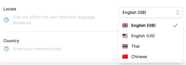
Now I can use this fully encapsulated Locale dropdown anywhere I need it, and it already knows how to generate all the locales I support:
    <% component.with_field do |c| %>
      <% c.with_attribute_locale_dropdown(
             attribute: :locale,
             label: resource_class.human_attribute_name(:locale),
             resource: resource,
             options: { readonly: readonly, help: t('.help.locale') }
         ) %>
    <% end %>
Here's what it looks like:
And that wraps it up for this Dropdown component (for now). If I add future functionality to it I will update this page.